This art is “Smiling Ginger Kitty”, 18 x 30, a batik from 6th grade in 1972. The original is available and prints are made in archival inks on Epson Cold Press Watercolor Paper, Hot Press Digital Giclee Paper or Artist Canvas.
ABOUT THE ART

“Smiling Ginger Kitty”, batik, 18″ x 30″, 1972 © Bernadette E. Kazmarski
When you are a “cat person”, it seems to begin with day one and work its way all through your life to the end, with cats intertwined with everything in between. And I’ve been looking at this batik I did in sixth grade and thinking how cool it would be to batik again…
In 2011, when I cleaned out, renovated and organized my spare bedroom into my studio I unearthed a number of works I’d had stored away in a portfolio for safe keeping when I ran out of room on my walls. That included this batik which I’d stretched but never framed, and seeing it again I was actually pretty impressed both with what I had accomplished as a 12-year-old in a media totally new to me as well as how I rendered the colors and stripe patterns on an orange tabby cat when my cat at the time was gray and white. I’d used my cat and cat themes in several art projects at that time and it seems I was determined to render my cats and cats in general in artwork even back then.
I clearly remember watching the teacher show us the batik process of painting melted wax onto the cloth and letting the wax harden and then dipping it in dye baths, using successively darker dyes with more wax coatings in between to resist the new color in those areas. I grew up watching people make pysanky, the highly patterned and multi-colored Ukrainian Easter eggs. I had made a few myself by that time and it was the same principle of covering an area with wax and then dipping it in dye. I actually remember painting the wax on the fabric in the correct areas and dipping the fabric into the dye, then later ironing it out onto newspaper.

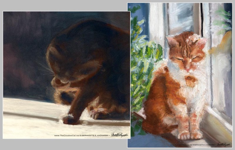
Detail of the face.
But my kitty was gray and white, and to my knowledge I didn’t know an orange kitty of anyone else’s very well at all, though I’m sure, knowing all the cats I encountered around our neighborhood, there was likely more than one tabby I encountered. I have no idea where the idea began, or even if I had a reference photo. I don’t remember actually visualizing the orange kitty with its paws rolled under and an orange kitty smile, like they do, but I remember sketching kitties in this shape at that time.
Since this process depended on the use of color, then, I chose the color of a cat I was sure I had seen, an orange cat; I loved bright colors then as now, and was particularly into pinks and oranges, especially fluorescent colors. Well, it was the early 70s. Well, the whole thing is kind of reminiscent of an early 70s style. And I realize how many things stay with us through the years as I recognize that influence still appears in what I do today.

Detail of the chest and paws.
But it also has echoes of The Cheshire Cat from Alice’s Adventures in Wonderland, long one of my favorite stories, and being an early cat person The Cheshire Cat was a favorite right away, along with The White Kitten.
Now that I look at it from the perspective of 25 years of drawing cats, I’m amazed at my 12-year-old’s observation skills and ability to visualize. How did I know where and how the stripes fell, how they were shaped, how they curved around the hip, and how some actually came up from the bottom rather than down from the top? And the subtle tone-on-tone orange, and the white bib? Perhaps the white bib was inspired by Bootsie’s white bib. What took me so long to get around to painting cats, like, 20 years later?

Detail of stripes.
This had hung high up on the wall in my studio for several years, but as I added height to the shelves I took it down and packed it away because it had become covered where it was hanging. The memory of it barely entered my consciousness until I discovered it. What luck! I’ve stretched and framed this behind glass so that it doesn’t get any dirtier. I can’t wait to batik again, but it’s proved a little tricky in this house with these particular cats.
This also reminds me it’s been years since I had an orange kitty in my “permanent collection” of cats, a few fosters, but not one who stayed since Allegro passed in 1996. Finally, his portrait is on my list of new paintings…
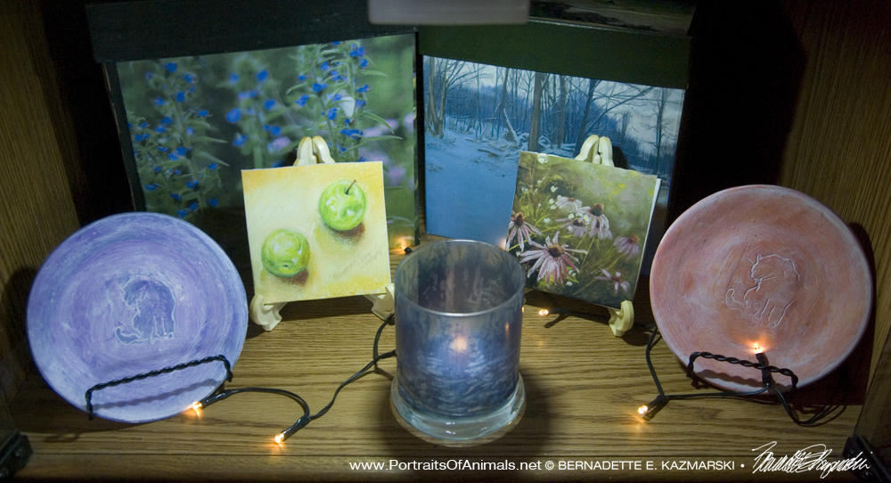
Find similar artwork
You can find more feline artwork in the galleries:
SHIPPING
Shipping within the US is included in all the prices listed. All shipping is via Priority Mail. Prints are shipped flat in a rigid envelope. Canvases are shipped in a box to fit with padding. Since this original is small it is also shipped in a box with extra padding.
PRINTS
Note that prints are not the same dimensions as the original and may be cropped on the top or sides to fit the dimensions of the print size.
GICLEE PRINTS
The giclees are printed on acid-free hot press art paper for a smooth matte finish using archival inks. Giclee is the highest quality print available because the technique uses a dozen or more ink ports to capture all the nuances of the original painting, including details of the texture, far more sensitive than any other printing medium. Sometimes my giclees look so much like my originals that even I have a difficult time telling them apart when they are in frames.
I don’t keep giclee prints in stock for most of my works. Usually I have giclees printed as they are ordered unless I have an exhibit where I’ll be selling a particular print so there is a wait of up to two weeks before receipt of your print to allow for time to print and ship.
DIGITAL PRINTS
Digital prints are made on acid-free matte-finish natural white 100# cover using archival digital inks. While digital prints are not the quality of a giclee in capturing every nuance and detail of color, texture and shading, I am still very pleased with the outcome and usually only I as the artist, could tell where detail and color were not as sharp as the original.
The giclees have 2″ of white around the outside edges. The 5″ x 7″ and 8″ x 10″ digital prints are centered on 8.5″ x 11″ digital cover while the 11″ x 14″ has 1″ around the edges because the digital paper is 12″ wide. All are countersigned by me.
CANVAS PRINTS
I usually have at least one of the smaller sizes of canvases on hand, but order larger ones as they are ordered here because customers often want a custom size. Smaller canvases are a 3/4″ in depth, Canvases 12 x 16 and larger are 1-1/2″ in depth. I set them up so the image runs from edge to edge, then the sides are black or white or sometimes I slip in a color that coordinates with the painting. This canvas is white on the sides.
FRAMED PRINT
All framing is done by me in my studio. This print is matted with a double mat 1.5″ wide, white on top with a rust underneath to match the outline of the two cats. The frame is a molded 1.25″ natural white flat painted wood. The backing is acid-free foam core and the glass is premium clear glass. On this piece, the frame and mats may vary slightly since both the mat and frame are on the list to be discontinued, though that may take more than a year. The framed pieces will definitely resemble the one shown here.
DAILY SKETCHES
I endeavor to do at least a small sketch each day as a warm-up to my aesthetic senses, so I have a small pouch of art materials and a few various sized sketchbooks available in the house and out. Usually, these are done in pencil, my first and favorite medium, though sometimes it’s charcoal, ink, colored pencil, ink and brush, whatever strikes my fancy at the moment, the greatest challenge to keep it quick and not get caught up in details, let the idea flow onto the paper.
Most often, the subjects are my cats because they are such willing models, though sometimes I’ll also wander afield, literally, and sketch in my yard or anywhere I go for errands. Medium and especially style vary just so I get a chance to do something new.
Every once in a while, they are meant for framing, and I’ve designed a series of notecards, notepaper and notepads using other daily sketches (see my notecards section). Often I use them as illustrations for graphics projects I’m designing.
Other items with the same art or design To find all items on this site with the same art or design, use the search box for the name of the artwork and you'll find all that's available.![]()
![]() Don’t miss any new items or opportunities!
Don’t miss any new items or opportunities!
“Follow” the Portraits of Animals blog with the link in the upper left. Sign up to receive posts in email, or in your favorite reader using the links in the right-hand column.
Sign up for e-newsletters
You can also sign up for my monthly e-newsletters to receive special discounts and find out where I’ll be with my artwork.
Click here for the Creative Cat Preview E-newsletter, for feline and animal-specific products and information.
Click here for the Art & Merchandise E-newsletter, for landscapes, nature, urban scenes and more.
For art, photos and writing as I develop it, visit my blogs.
See feline art and photos as they happen on The Creative Cat, along with feline news, health, welfare, rescue stories and more.
See daily photos as I post them on Today.
Read poetry, short stories, essays and more on Paths I Have Walked.
. . . . . . .
© 2022 | www.PortraitsOfAnimals.net | Published by Bernadette E. Kazmarski
All images used on this site are copyrighted to Bernadette E. Kazmarski unless otherwise noted and may not be used without my written permission. Please ask if you are interested in using one in a print or internet publication. If you are interested in purchasing a print of this image or a product including this image, check to see if I have it available already. If you don’t find it there, visit “purchasing” for availability and terms.