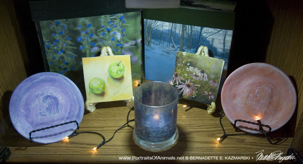
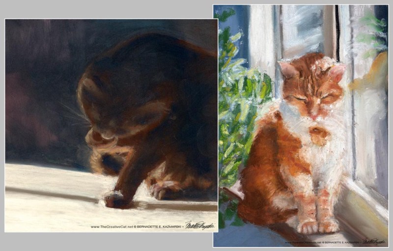
This art is “Grape Jelly Bean”, 5″ x 7″ oil pastel on textured paper, © Bernadette E. Kazmarski, signed and dated 12/21/11. The original is sold but various prints are available.

Grape Jelly Bean
ABOUT THE ART
In oil pastel, but predating “Cats After van Gogh”, this was officially the first oil pastel of all my daily sketches.
I have more art materials close at hand in my studio and I’ve had this idea for working in oil pastel and Jelly Bean was the intended subject. Jelly Bean settled himself under my work lights as I had envisioned and voilà, there is a Grape Jelly Bean.
I frequently work in chalk pastel, especially for commissioned portraits, because of its versatility in application and range of colors from delicate to vibrant to deep. Chalk pastels are made from pure pigment in a binder ranging from fine clay to gum arabic or cellulose to form a shape to be held in hand to draw and are, as the term “chalk” would describe, a dry medium.
Oil pastels may have a similar name but that’s about the end of the similarity. A relatively new medium at less than 100 years old, the pigment is combined with a non-drying oil and wax which makes it more like a soft crayon, and that was exactly what it felt like when I first began to work with it years ago, a crayon! I put it aside, disliking the feel of it and my lack of control, but when I worked in an art supply store and frame shop, I framed an oil pastel drawing that absolutely fascinated me with how it had been applied with abandon, layered, and even had areas carved out of it nearly down to the paper to create visual and physical texture.
Where chalk pastel is blended like a powder, oil pastel is much more difficult to blend but may be done by drawing one color atop the other, using a burnishing tool or paper stomp or even using a solvent medium like linseed oil or turpentine, so I put all the techniques to use.
What I wanted to use was the way the colors do and don’t combine, using just about every color in the box to create the highlights and shadows. And though the Bean is a little black cat, there is not one dot of black anywhere on here. That was the other part of the assignment for me—non-representational color! After nearly a month of these sketches I feel a little more confident about loosening up, and in fact just dropped what I was doing, grabbed the little sketch pad and the red violet pastel and started sketching, adding other colors, layering, and overlaying.
The regular drawing paper I use would work okay for this, but that paper is rather thin and working heavily as I had intended with this would stretch and wrinkle the paper. I found a stack of little 5″ x 7″ sketch pads at, of all places, JoAnn Fabrics for $1.00 each. Who would be afraid to experiment with that kind of an investment? Intended for acrylic paint, this is thicker and has more texture than the usual sketch paper I use. This sketch is also smaller—the actual image is only 3.5″ x 5.5″; not sure why, that’s just the way it worked out.
I love Jelly Bean’s very roundness. While he is probably just a little rounder than he should be, he also has stocky characteristics and likes to bunch himself up so that he looks like a bunch of balls of yarn perhaps, all stuck together. In fact, I did an earlier sketch of him today entitled “Circles” which I will save for a day when I don’t have one where he is sitting crouched on the top of the stool at my easel just being very round from his head to his paws.
ABOUT MY WORK IN OIL PASTEL
This sketch predates this, but led directly to it. I’ve been working out this style now following Two Cats After van Gogh. I traveled with a friend in April 2012 to see the “Van Gogh Up Close” exhibit. All the way home on the Megabus I remembered the colors and shapes and textures, and wanted to work the same energy and form I saw in his brush strokes, visualizing oil pastel to layer and blend the strokes as an experiment. Arriving home in Pittsburgh just a few hours later I saw Giuseppe and Mr. Sunshine, just quietly hanging together on the landing, Giuseppe sitting upright, Sunshine loafing, and visualized exactly what I would sketch, and posted Two Cats After van Gogh as my daily sketch that very day.
After seeing so many van Gogh paintings up close in the exhibit my goals in working “after van Gogh”, or in the style of van Gogh, are to be aware of the colors he used, and why, and to use the textures to build the image, so that every color and stroke, and the shape, direction and energy of the strokes, would be important to the painting. Like poetry, nothing is extra, nothing is wasted.
Mimi is the subject of another oil pastel, In Window Light, and also participates in yet another oil pastel with Mewsette, Kitty Spoons.
You can see other oil pastels in Two Cats After van Gogh and you can also see other feline artwork in the following galleries:
ABOUT MY DAILY SKETCHES
I endeavor to do at least a small sketch each day as a warm-up to my aesthetic senses, so I have a small pouch of art materials and a few various sized sketchbooks available in the house and out. Usually, these are done in pencil, my first and favorite medium, though sometimes it’s charcoal, ink, colored pencil, ink and brush, whatever strikes my fancy at the moment, the greatest challenge to keep it quick and not get caught up in details, let the idea flow onto the paper.
Most often, the subjects are my cats because they are such willing models, though sometimes I’ll also wander afield, literally, and sketch in my yard or anywhere I go for errands. Medium and especially style vary just so I get a chance to do something new.
Every once in a while, they are meant for framing, and I’ve designed a series of notecards, notepaper and notepads using other daily sketches (see my notecards section). Often I use them as illustrations for graphics projects I’m designing.
SHIPPING
Shipping within the US is included in all the prices listed. All shipping is via Priority Mail. Prints are shipped flat in a rigid envelope. Canvases are shipped in a box to fit with padding. Since this original is small it is also shipped in a box with extra padding.
PRINTS
Note that prints are not the same dimensions as the original and may be cropped on the top or sides to fit the dimensions of the print size.
GICLEE PRINTS
The giclees are printed on acid-free hot press art paper for a smooth matte finish using archival inks. Giclee is the highest quality print available because the technique uses a dozen or more ink ports to capture all the nuances of the original painting, including details of the texture, far more sensitive than any other printing medium. Sometimes my giclees look so much like my originals that even I have a difficult time telling them apart when they are in frames.
I don’t keep giclee prints in stock for most of my works. Usually I have giclees printed as they are ordered unless I have an exhibit where I’ll be selling a particular print so there is a wait of up to two weeks before receipt of your print to allow for time to print and ship.
DIGITAL PRINTS
Digital prints are made on acid-free matte-finish natural white 100# cover using archival digital inks. While digital prints are not the quality of a giclee in capturing every nuance and detail of color, texture and shading, I am still very pleased with the outcome and usually only I as the artist, could tell where detail and color were not as sharp as the original.
CANVAS PRINTS
I usually have at least one of the smaller sizes of canvases on hand, but order larger ones as they are ordered here because customers often want a custom size. Smaller canvases are a 3/4″ in depth, Canvases 12 x 16 and larger are 1-1/2″ in depth.
FRAMED PRINT
All framing is done by me in my studio. This print is matted with a double mat 1.5″ wide, white on top with a rust underneath to match the outline of the two cats. The frame is a molded 1.25″ natural white flat painted wood. The backing is acid-free foam core and the glass is premium clear glass. On this piece, the frame and mats may vary slightly since both the mat and frame are on the list to be discontinued, though that may take more than a year. The framed pieces will definitely resemble the one shown here.
Other items with the same art or design To find all items on this site with the same art or design, use the search box for the name of the artwork and you'll find all that's available.![]()
![]() Don’t miss any new items or opportunities!
Don’t miss any new items or opportunities!
“Follow” the Portraits of Animals blog with the link in the upper left. Sign up to receive posts in email, or in your favorite reader using the links in the right-hand column.
Sign up for e-newsletters
You can also sign up for my monthly e-newsletters to receive special discounts and find out where I’ll be with my artwork.
Click here for the Creative Cat Preview E-newsletter, for feline and animal-specific products and information.
Click here for the Art & Merchandise E-newsletter, for landscapes, nature, urban scenes and more.
For art, photos and writing as I develop it, visit my blogs.
See feline art and photos as they happen on The Creative Cat, along with feline news, health, welfare, rescue stories and more.
See daily photos as I post them on Today.
Read poetry, short stories, essays and more on Paths I Have Walked.
. . . . . . .
© 2022 | www.PortraitsOfAnimals.net | Published by Bernadette E. Kazmarski
All images used on this site are copyrighted to Bernadette E. Kazmarski unless otherwise noted and may not be used without my written permission. Please ask if you are interested in using one in a print or internet publication. If you are interested in purchasing a print of this image or a product including this image, check to see if I have it available already. If you don’t find it there, visit “purchasing” for availability and terms.