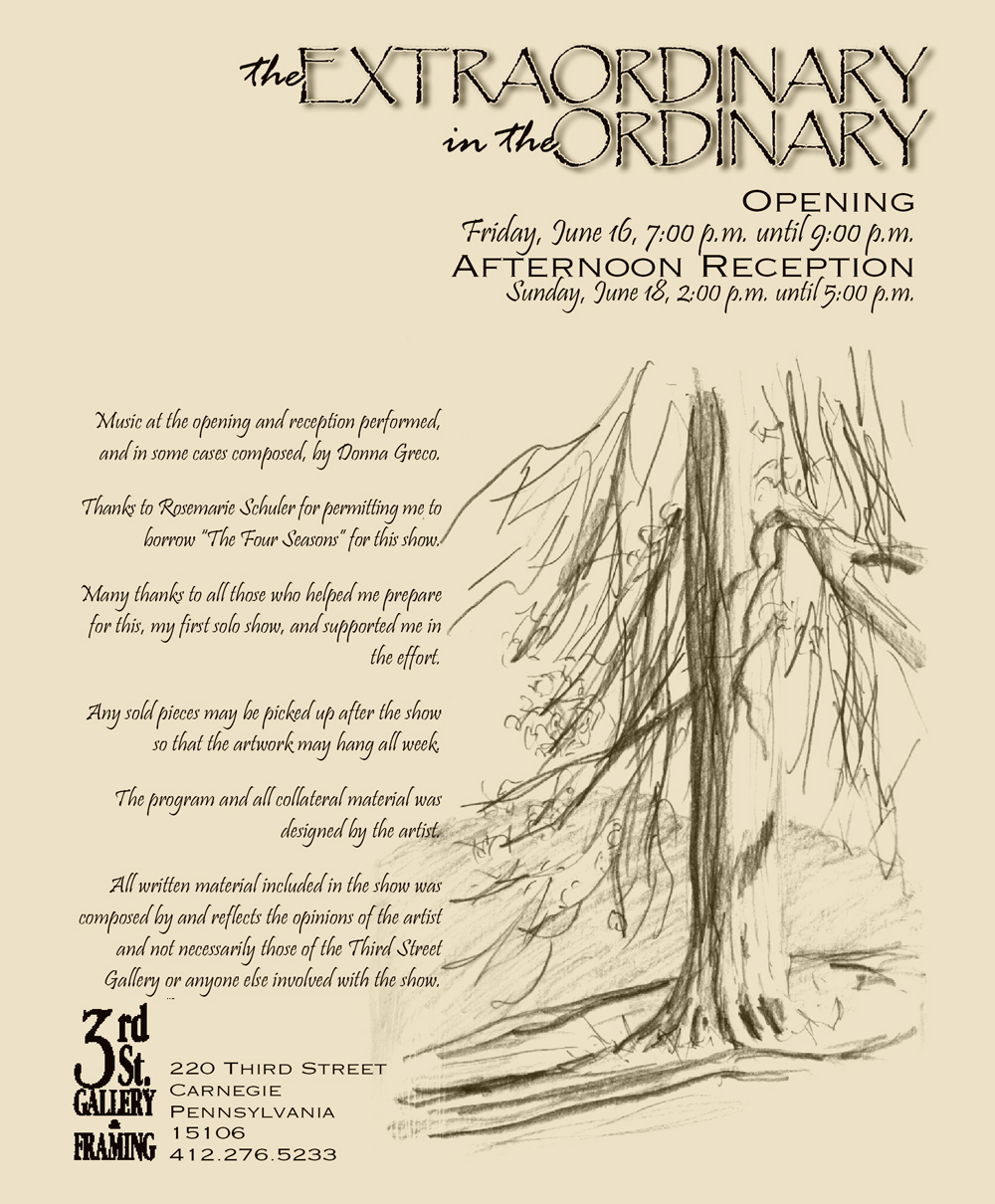
“The Extraordinary in the Ordinary:
Celebrating the art in everyday life”
In every moment of every day, everywhere I go, I see something extraordinarily beautiful and inspiring.

The post card invitation to my first solo exhibit.
I left my day job to work at home as a commercial artist, fine artist and writer on January 1, 2000 after freelancing as a graphic designer and participating in art exhibits hosted by membership organizations while working full time for over a decade. One of the primary reasons I left my day job to work at home was to have more time to develop my career as a fine artist and “get to my writing” whatever that worked out to be, so one of my first priorities, since I already had a list of regular customers, was to plan my first solo art exhibit.
I actually began planning in January, only waiting because I really wasn’t totally certain when I’d leave my day job, but a local gallery where I’d hung my artwork for years would be the place, and they could fit me in later in the year. I was grateful because other than promoting it I had no idea what to include or what to say.
I’d been working in advertising and promotions for years so the place to begin was a title. I had a good idea of what inspired me and that was what I wanted to use, but how to sum it up? I remembered this phrase, “the extraordinary in the ordinary”, from something I’d read over the years and it stayed with me, and I knew it fit well with my work: finding those moments that took my breath away and interpreting them as best I could in whatever medium seemed to suit the moment best, from my cats to landscapes to flowers and the streets of my home town.
I would have an opening reception on a Friday night, and then an afternoon reception on Sunday.

The back of the post card invitation to my first solo exhibit.
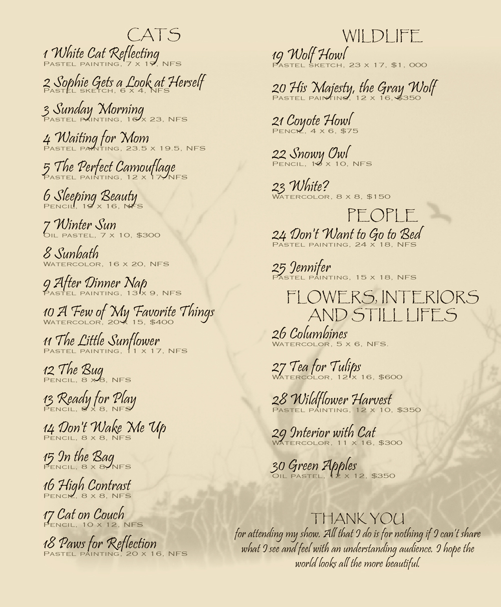
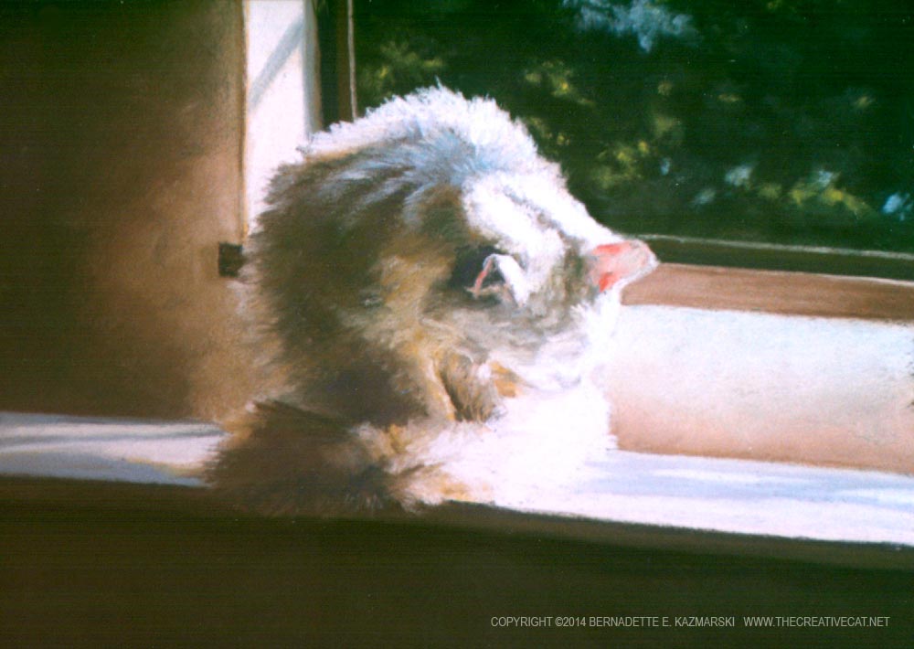
The artwork I chose the exhibit was, well, just about everything I’d done to that point in my life…I’m a little embarrassed when I think about it, but I was almost afraid I’d never have another chance! But as much as I liked the older paintings, the image I chose for the post card was a newer painting done in a looser style, and though not en plein air I had tried my best to capture that feeling of walking up a path and seeing this, and carrying that inspiration into my little painting. It’s called “Into the Woods at Frankfort Springs”, stepping into the wooded path and seeing the sun-splashed clearing, the ancient cabin, the dense shadows and brilliant sunlight; I didn’t get a good clear photo of it before it went off, so the image is a little soft.
-
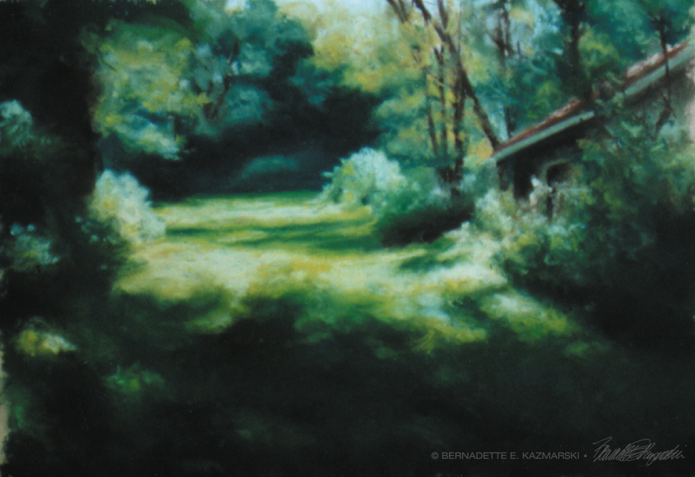
- “Into the Woods”, 10″ x 9″, pastel on Wallis pastel paper, 1999 © Bernadette E. Kazmarski
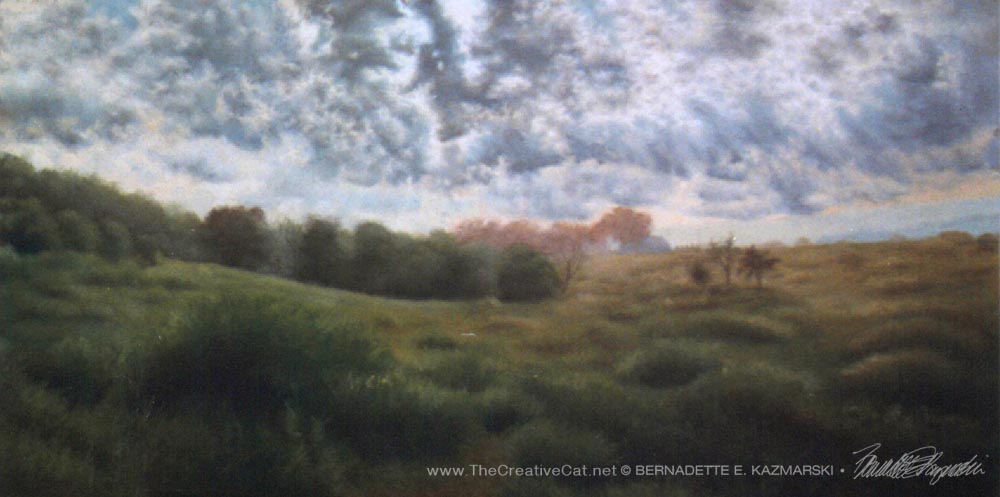
In addition to the artwork I worked my writing into the exhibit by pairing images with poems or essays or statements to make little flyers that I could print out on 8.5″ x 11″ paper and mount on the wall. I used the poem Clouds featuring the autumn landscape from my four seasons series because those purple clouds are just as much autumn to me as the colorful leaves.
-
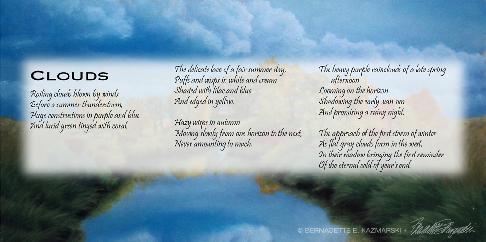
- Clouds
-
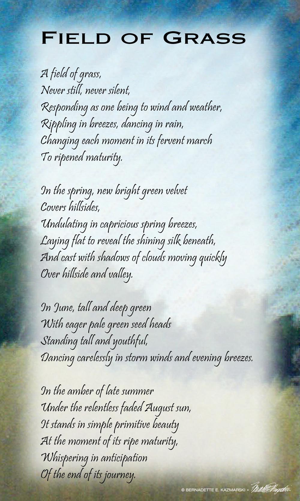
- Field of Grass
-
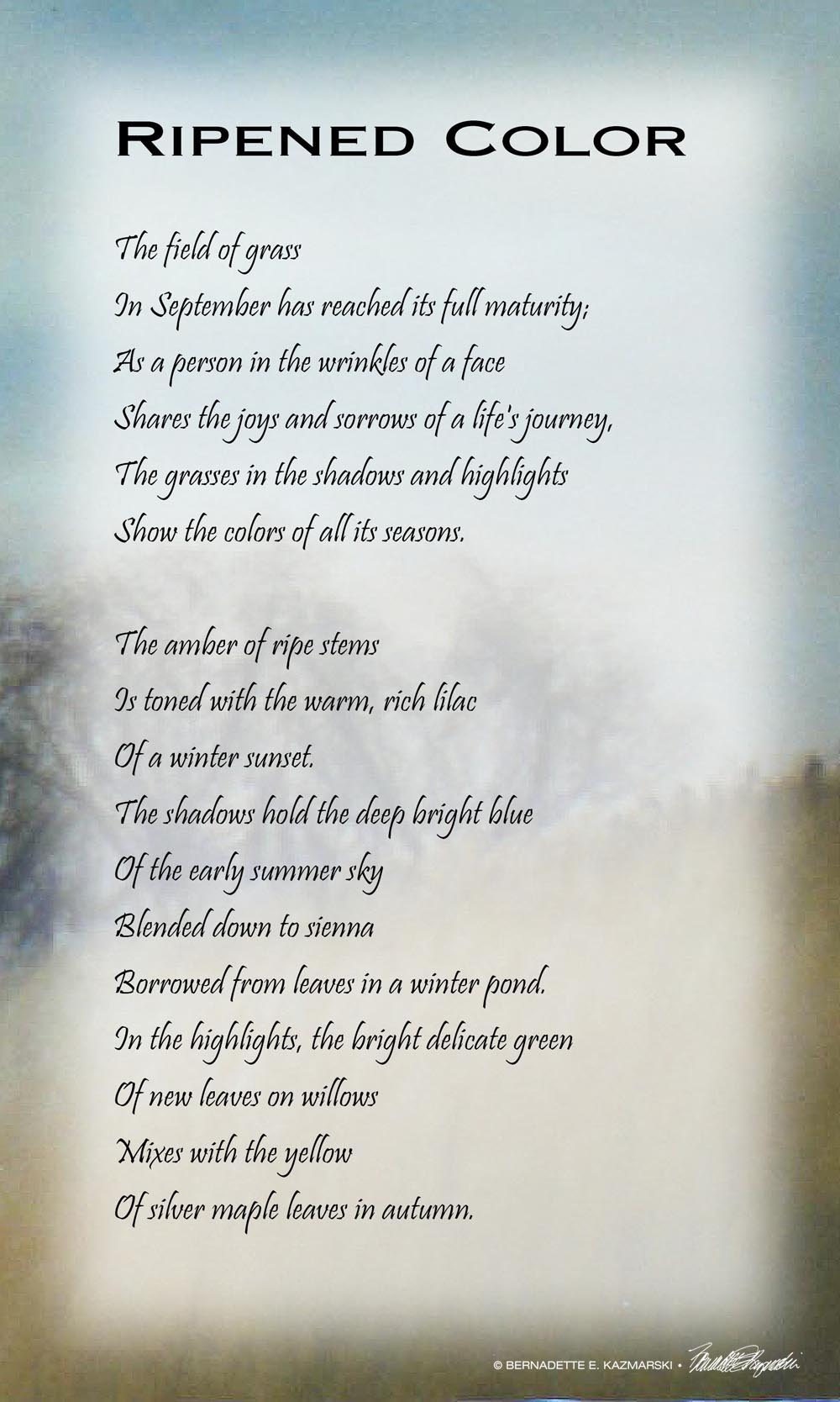
- Ripened Color
-
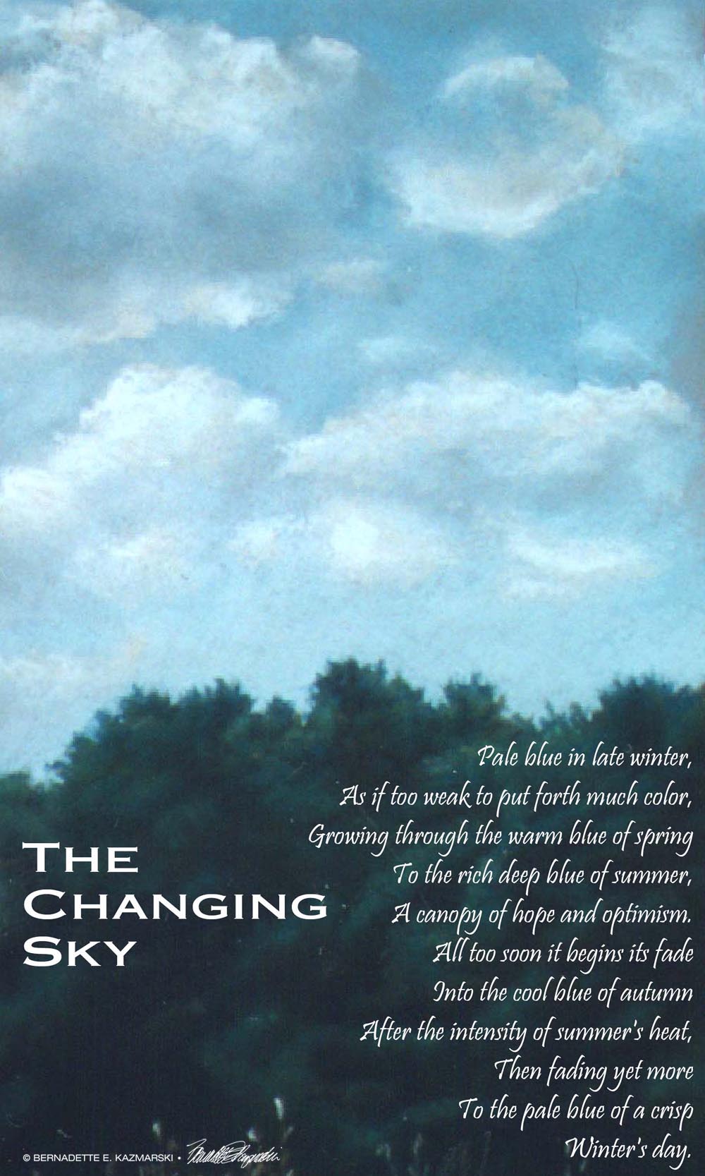
- The Changing Sky
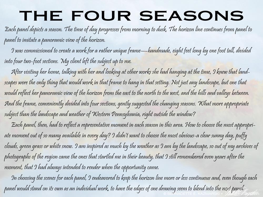
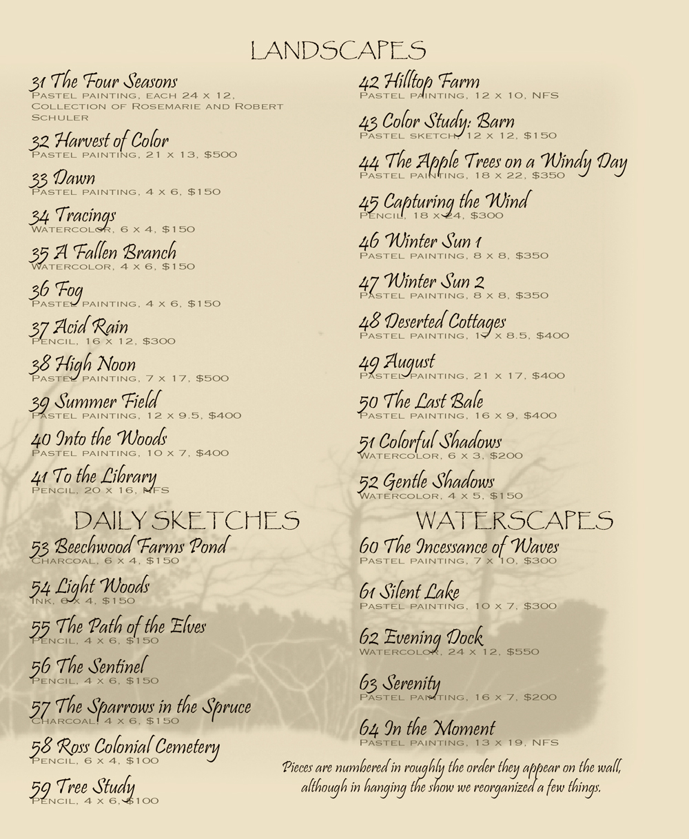
A special part of the exhibit was “The Four Seasons” which I had just recently finished. I was commissioned to create a work for a rather unique frame—handmade, eight feet long by one foot tall, divided into four two-foot sections. My client left the subject up to me.
After visiting her home, talking with her and looking at other works she had hanging at the time, I knew that landscapes were the only thing that would work in that frame to hang in that setting. Not just any landscape, but one that would reflect her panoramic view of the horizon from the east to the north to the west, and the hills and valleys between. And the frame, conveniently divided into four sections, gently suggested the changing seasons. What more appropriate subject than the landscape and weather of Western Pennsylvania, right outside the window?
Each panel depicts a season. The time of day progresses from morning to dusk. The horizon line continues from panel to panel to imitate a panoramic view of the horizon.
-
- Spring
-
- Summer
-

- Autumn
-
- Winter, pastel, 12 x 24, 1998 © Bernadette E. Kazmarski
Each panel, then, had to reflect a representative moment in each season in this area. How to choose the most appropriate moment out of so many available in every day? I didn’t want to choose the most obvious-a clear sunny day, puffy clouds, green grass or white snow. I am inspired as much by the weather as I am by the landscape, so out of my archives of photographs of the region came the ones that startled me in their beauty, that I still remembered even years after the moment, that I had always intended to render when the opportunity came.
In choosing the scenes for each panel, I endeavored to keep the horizon line more or less continuous and, even though each panel would stand on its own as an individual work, to have the edges of one drawing seem to blend into the next panel.
-
- The Four Seasons
-
- Spring
-
- Summer
-
- Autumn
-

- Winter
One of the cutest things is that I publicly thanked my cats for inspiring me to be an artist:
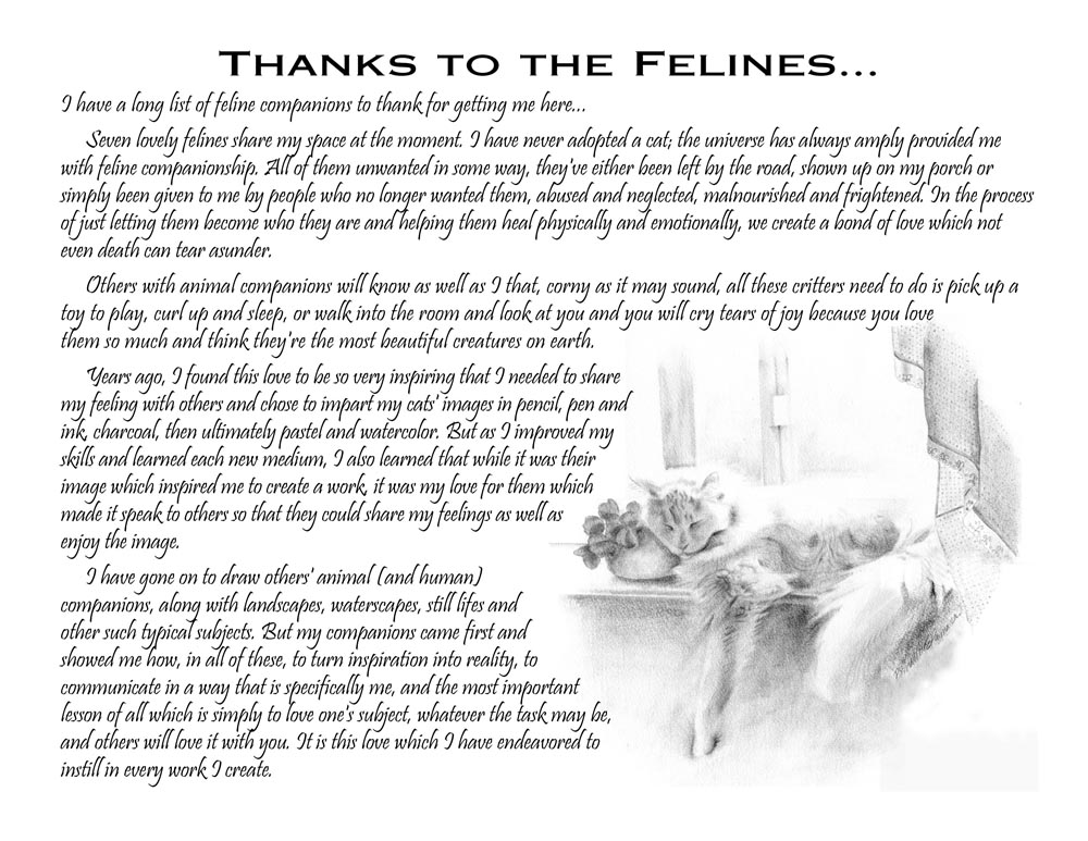
I have a long list of feline companions to thank for getting me here…
Seven lovely felines share my space at the moment. I have never adopted a cat; the universe has always amply provided me with feline companionship. All of them unwanted in some way, they’ve either been left by the road, shown up on my porch or simply been given to me by people who no longer wanted them, abused and neglected, malnourished and frightened. In the process of just letting them become who they are and helping them heal physically and emotionally, we create a bond of love which not even death can tear asunder.
Others with animal companions will know as well as I that, corny as it may sound, all these critters need to do is pick up a toy to play, curl up and sleep, or walk into the room and look at you and you will cry tears of joy because you love them so much and think they’re the most beautiful creatures on earth.
Years ago, I found this love to be so very inspiring that I needed to share my feeling with others and chose to impart my cats’ images in pencil, pen and ink, charcoal, then ultimately pastel and watercolor. But as I improved my skills and learned each new medium, I also learned that while it was their image which inspired me to create a work, it was my love for them which made it speak to others so that they could share my feelings as well as enjoy the image.
I have gone on to draw others’ animal (and human) companions, along with landscapes, waterscapes, still lifes and other such typical subjects. But my companions came first and showed me how, in all of these, to turn inspiration into reality, to communicate in a way that is specifically me, and the most important lesson of all which is simply to love one’s subject, whatever the task may be, and others will love it with you. It is this love which I have endeavored to instill in every work I create.
-
- Thanks to my felines
I had all the artwork framed and only had to organize it, and planned my post cards, the food and publicity and the program, back in those days when you still faxed a press release and color digital printing was available but expensive. I thought I had it all well in hand until my brother suffered a traumatic brain injury at the end of April, and his care and progress through the system made me consider postponing or cancelling the show because I wanted to give my show all of me, not the leftovers, but friends and the gallery owner convinced me that wasn’t necessary. I was also a little scared, and I was glad everyone insisted I follow through. I worked on the program between work at home and doctor appointments, designing it to be printed at home on my trusty laser printer using some of my art in pencil and charcoal and ink, and I settled on legal size paper in a light kraft color, which I tried to represent here but did not, but that’s okay. You can see some of the art in the pages of the program, and a list of the paintings, some of which I still have, and many you can find by title on my main website.
-

- Front cover of program.
-
- Inside left of program.
-
- Inside right of program.
-
- Back cover of program.
In the end I didn’t sell much but I knew it was because I hadn’t curated the content. I learned quite a bit, and decided having shows wasn’t so frightening after all, and that I’d look for opportunities to have others because I already had ideas for new artwork, and how better to share it? It was not too early to start thinking about my exhibit for 2001 so with ideas from my first exhibit I decided that June was probably a good month since my commercial business began to slow down about that time and I could have all new artwork.
Images in This Exhibit
Here are links to the images I have either as originals or prints here on Portraits of Animals. Below this selection is a gallery of even more images.


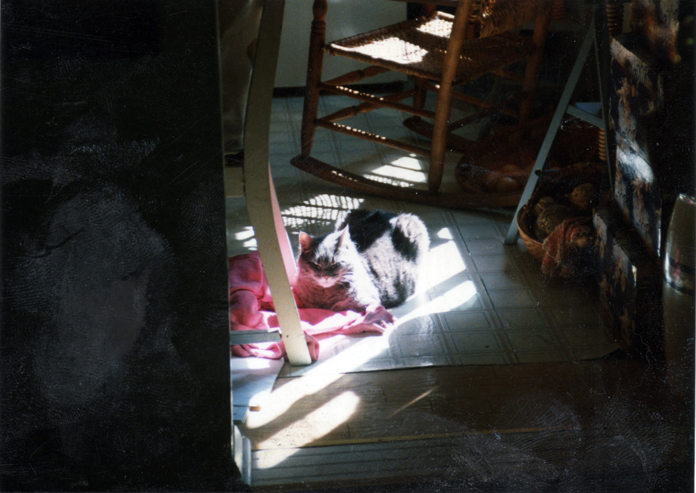
This is a pastel painting, “A Rosy Glow”, pastel on velour paper, 10″ x 10″, 1996 © Bernadette E. Kazmarski.
About Moses
Sweet, soft silver tabby Moses was my one truly feral rescue and taught me about feral cats before I really knew they were any different from other cats. My niece caught her and I took Moses home in 1987 before I’d ever heard a word about feral cats and kittens. I’d caught and rescued quite a few cats and kittens by that time and thought Moses was just another bedraggled, starved kitten. And she was until three days after she’d come into my house and her strength and wits were back, and instead of looking up at me weakly purring and blinking she ran behind the toilet and unblinkingly stared at me.
I’m accustomed to that stare now, but everything I know today about socializing cats began with her. Moses was about five months old when she came to me, past the age that’s typically able to be socialized, but she and I did well, with her leading the way. Our 19 years together were one long lesson in patience for me as I let Moses come to terms, at her own pace, with living with a human who just wanted to touch her all the time. I kept my hands off, and she came to me, sleeping under my chair, on the floor under my easel, on my yoga mat, on my other pillow. She patiently taught me the basics of creating a space where an unsocialized cat felt safe, and with each frightened, traumatized or unsocialized cat I welcome to my home, I remember her.
This painting is no less a celebration of feral cats than an article I might write. Feral cats aqnd kittens often have the reputation of not being able to be “saved” and so they are often exterminated like vermin when they are found to be unwanted living outdoors, and are usually euthanized in shelters without being given a chance to adjust to life with humans, and yet here she is looking pretty pleased with her situation.
This painting is about one of the moments in those years I saw Moses coming to terms with the fears and mistrust she’d learned growing up in her colony of cats, in fact, it was inspired by the evidence of that very healing. I looked in the dining room and there was Moses in the middle of the floor—Moses, who walked about under and behind the furniture, who never left herself vulnerable, who never had a nap in an open spot, like the middle of the floor. And yet there she was, and she was looking pretty confident and relaxed. She had never done anything like this before. She was nine years old.
About the painting
I actually painted the portrait fairly quickly as I’d been working on a series of paintings of my cats in the sun in that same colorful yet realistic style I’d developed. As I explained this painting when entering it into my portfolio:
She found a warm spot to sleep in the sun on that old pink sweater of mine, and the look of contentment on her face was my first inspiration, especially since Miss Moses (we all thought she was a boy) had been a feral kitten and to this day hesitates to walk across the center of any room but finds security in keeping close to the furniture. Next, the contrast of all the grays with the varied pink shades in the sweater and the patterns of direct and reflected sunlight all through the scene made me snap that photo and render this scene.
It’s called “A Rosy Glow” because her silvery gray fur reflects the bright pink sweater onto her chest and face which for me added to that feeling of comfort and security I felt from her in that moment.
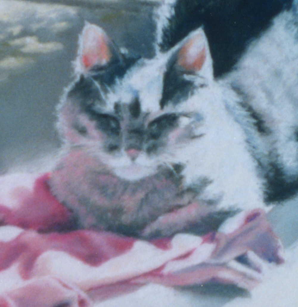
One of these days I’ll look up the person who purchased this portrait and I’ll be able to scan the actual portrait, but for now you’ll just have to imagine the details. Looking closely at the gray of her fur, though, and the bright pink reflected, you’ll also see there is obviously blue and green along with softer tones of violet and rose to give her thick fur the depth I remembered when touching her. Even when she wasn’t in the sun her gray fur was full of complimentary colors that our eye puts together into one overall tone, but studying in detail over time you’ll see all those hues. Her nose was “terra cotta” as I called it, that natural color of red earth, but here it is reflecting that sweater.
When I painted it so the pink reflected as brightly as it does in the reference photo it simply looked overdone; I still had a bit to learn about handling colors and areas like that. Yes, I decided to move the chair, and a lot of other stuff…
In the background too you’ll see many colors mixed in with the gray of the shadows to keep them lively.
I still treasure this moment, and each moment when Moses took a step toward trust. Read Moses’ story in “My Favorite Feral, and My Enlightenment”.
Purchasing prints
This painting is included on one set of cards, “My Cat in the Sun”.
SHIPPING
Shipping within the US is included in all the prices listed. All shipping is via Priority Mail. Prints are shipped flat in a rigid envelope. Canvases are shipped in a box to fit with padding. Since this original is small it is also shipped in a box with extra padding.
GICLEE PRINTS
The giclees are printed on acid-free hot press art paper for a smooth matte finish using archival inks. Giclee is the highest quality print available because the technique uses a dozen or more ink ports to capture all the nuances of the original painting, including details of the texture, far more sensitive than any other printing medium. Sometimes my giclees look so much like my originals that even I have a difficult time telling them apart when they are in frames. The giclees have 2″ of white around the outside edges.
I don’t keep giclee prints in stock for most of my works. Usually I have giclees printed as they are ordered unless I have an exhibit where I’ll be selling a particular print so there is a wait of up to two weeks before receipt of your print to allow for time to print and ship.
DIGITAL PRINTS
Digital prints are made on acid-free matte-finish natural white 100# cover using archival digital inks. While digital prints are not the quality of a giclee in capturing every nuance and detail of color, texture and shading, I am still very pleased with the outcome and usually only I as the artist, could tell where detail and color were not as sharp as the original.
The 5″ x 7″ and 8″ x 10″ digital prints are centered on 8.5″ x 11″ digital cover while the 11″ x 14″ has 1″ around the edges because the digital paper is 12″ wide. All are countersigned by me.
CANVAS PRINTS
I usually have at least one of the smaller sizes of canvases on hand, but order larger ones as they are ordered here because customers often want a custom size. Smaller canvases are a 3/4″ in depth, Canvases 12 x 16 and larger are 1-1/2″ in depth. I set them up so the image runs from edge to edge, then the sides are black or white or sometimes I slip in a color that coordinates with the painting. This canvas is black on the sides.
MOUSEPADS
Mousepads are 8″ x 7″, always horizontal, 1/4″ black foam rubber with the image printed on a flexible fabric on top.
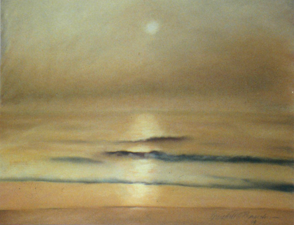
Atlantic Sunrise, pastel, original is sold but prints are available on paper and canvas.
Atlantic Sunrise, pastel, 23″ x 17″, 1994 © Bernadette E. Kazmarski
ABOUT THE ARTWORK
I saw the ocean for the first time when I was 30, and was completely overwhelmed with all the sights and sounds of the area. This scene is the beach on Assateague Island, VA, on a foggy September morning. At first, I could only hear the waves and not see them, then the sun rose high enough above the fog to light the scene in rich gold.
SHIPPING AND CHARGES
Shipping within the US is included in the cost of each print.
Prints up to 16″ x 20″ are shipped flat in a rigid envelope. Larger prints are shipped rolled in a mailing tube unless otherwise requested; flat shipping is an extra cost because it’s oversized.
Other items with the same art or design To find all items on this site with the same art or design, use the search box for the name of the artwork and you'll find all that's available.![]()
![]() Don’t miss any new items or opportunities!
Don’t miss any new items or opportunities!
“Follow” the Portraits of Animals blog with the link in the upper left. Sign up to receive posts in email, or in your favorite reader using the links in the right-hand column.
Sign up for e-newsletters
You can also sign up for my monthly e-newsletters to receive special discounts and find out where I’ll be with my artwork.
Click here for the Creative Cat Preview E-newsletter, for feline and animal-specific products and information.
Click here for the Art & Merchandise E-newsletter, for landscapes, nature, urban scenes and more.
For art, photos and writing as I develop it, visit my blogs.
See feline art and photos as they happen on The Creative Cat, along with feline news, health, welfare, rescue stories and more.
See daily photos as I post them on Today.
Read poetry, short stories, essays and more on Paths I Have Walked.
. . . . . . .
© 2016-2026 | www.PortraitsOfAnimals.net | Published by Bernadette E. Kazmarski
All images used on this site are copyrighted to Bernadette E. Kazmarski unless otherwise noted and may not be used without my written permission. Please ask if you are interested in using one in a print or internet publication. If you are interested in purchasing a print of this image or a product including this image, check to see if I have it available already. If you don’t find it there, visit “purchasing” for availability and terms.
Winter is 12″ x 24″, and though the original is sold I offer a variety of prints on canvas or paper.
ABOUT THE ARTWORK
Winter, pastel, 12 x 24, 1998 © Bernadette E. Kazmarski
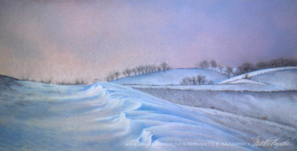
Winter is represented by the frozen hillsides of a farm drifted with snow and reflecting the colors of a winter sunset. The quiet, stillness and subtle color, the snow drifted up against the fencelines in the distance and caught on the clumps of flattened grasses and brush in the fields, the flat sky reflecting the glow of the sun now gone, are all visions that I associate with winter. Even when you don’t see the wind pushing and drifting the snow, you can see the effect in the drift as it is shaped and carved by an unseen hand, and other areas, scoured clean of all but a dusting and left to freeze.
This photograph was taken by a friend of mine who lives on this working dairy farm that I visited when I began painting en plein air. I found this frozen, still sunset absolutely beautiful, the quiet of the empty fields and big open sky, the sound of the wind, the sky gently fading to violet and the windrows and fences marking off the edges of the fields, like a quilt, each angle catching a different shade of fading light.
When I look at this painting, I hear my Windham Hill recordings of Winter Solstice I and II, if you’re familiar with those new age recordings from the 1980s.
Winter is one of a quartet of paintings, “The Four Seasons”, commissioned to fit a special handmade frame. Scroll down to read about the creation of “The Four Seasons”.
SHIPPING
Shipping within the US is included in all the prices listed. All shipping is via Priority Mail. Prints are shipped flat in a rigid envelope. Canvases are shipped in a box to fit with padding. Since this original is small it is also shipped in a box with extra padding.
GICLEE PRINTS
The giclees are printed on acid-free hot press art paper for a smooth matte finish using archival inks. Giclee is the highest quality print available because the technique uses a dozen or more ink ports to capture all the nuances of the original painting, including details of the texture, far more sensitive than any other printing medium. Sometimes my giclees look so much like my originals that even I have a difficult time telling them apart when they are in frames. The giclees have 2″ of white around the outside edges.
I don’t keep giclee prints in stock for most of my works. Usually I have giclees printed as they are ordered unless I have an exhibit where I’ll be selling a particular print so there is a wait of up to two weeks before receipt of your print to allow for time to print and ship.
DIGITAL PRINTS
Digital prints are made on acid-free matte-finish natural white 100# cover using archival digital inks. While digital prints are not the quality of a giclee in capturing every nuance and detail of color, texture and shading, I am still very pleased with the outcome and usually only I as the artist, could tell where detail and color were not as sharp as the original.
The 5″ x 7″ and 8″ x 10″ digital prints are centered on 8.5″ x 11″ digital cover while the 11″ x 14″ has 1″ around the edges because the digital paper is 12″ wide. All are countersigned by me.
CANVAS PRINTS
I usually have at least one of the smaller sizes of canvases on hand, but order larger ones as they are ordered here because customers often want a custom size. Smaller canvases are a 3/4″ in depth, Canvases 12 x 16 and larger are 1-1/2″ in depth. I set them up so the image runs from edge to edge, then the sides are black or white or sometimes I slip in a color that coordinates with the painting.
About “The Four Seasons”
“The Four Seasons” © Bernadette E. Kazmarksi
Years ago a patron of a gallery in Carnegie where I hung my artwork asked me to paint four images for a very special frame she had.
The frame had been designed and handmade in wood by her father-in-law, was long and narrow, and had four openings, each 12″ high by 24″ wide. Each opening had its own piece of glass, and between each opening was a 1/2″ slat of wood as a divider. The outside border of the frame was 2″ wide and flat with hand carved figures which I believe were leaves, like a vine. Overall it had a warm and rustic appearance.
The frame came apart in the center so that there were two panels in each half, and art and glass slid in and out through this opening. The area for the artwork was barely deep enough for a piece of drawing paper, so he must have intended it for photos when he designed it. The frame locked together in the back so that the two halves held together and hung on the wall without sagging.
She was interested in pastel drawings on paper, which were a good choice for this since even flat painting panels would not have fit.
As soon as she described the frame to me I thought of painting the four seasons, in part because of the four sections of the frame, and it’s also a theme I enjoy here in Western Pennsylvania. The customer would enjoy it too, because I’d been to her house and large picture windows were placed to enjoy the landscape from all angles, and the view of the countryside was something she always mentioned.
So I collected reference photos from my rambles for each of the seasons, thinking purely of landscapes. Skies are one of my favorite daily studies, no matter the season; I could watch skies forever, the clouds moving, the changing light. Choosing the right moment of sky to paint into a landscape is a very serious choice for me, as you’ll see in looking at all four paintings in this series.
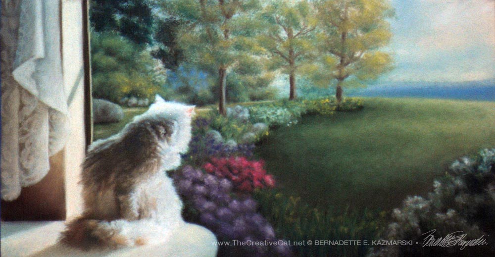
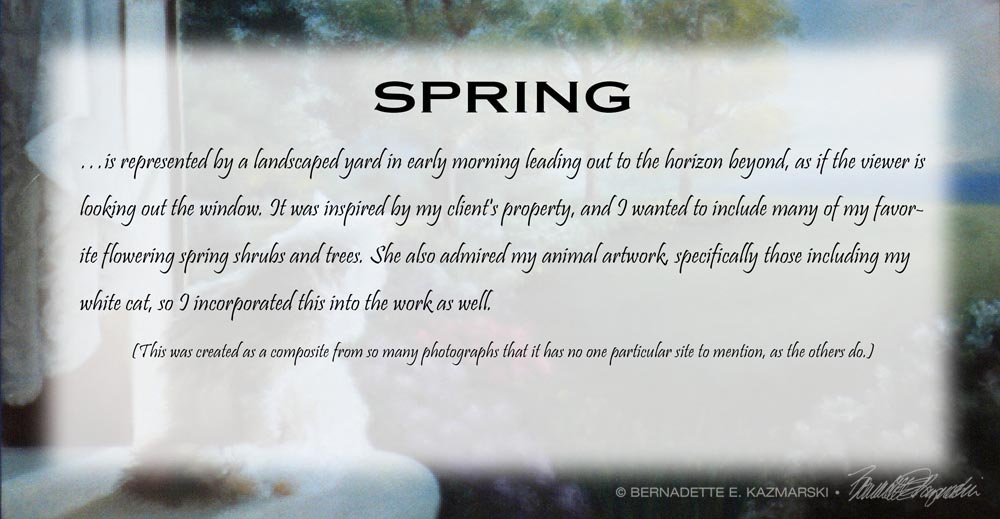
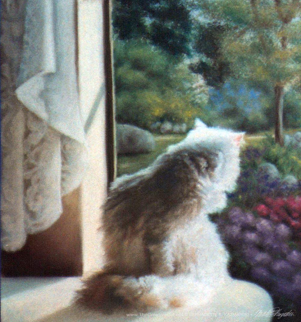
But she loved white cats and had actually purchased my painting “A Warm Bath” featuring my Angora cat Sally in a bath in morning sun at my side window, and asked me to add a white cat in somewhere since she’d given that painting as a gift. I really considered the best way to include a cat in the first panel, “Spring”. The scenes of the landscapes were typical of landscape paintings, showing the middle and far distance, where a cat would be hard to spot. For the landscape itself I remembered the layout of her yard and acreage, and collected some of my favorite photos of spring blooming garden.
But I remembered one of her picture windows and a countertop that extended partway in front of it and decided what I’d do. I had taken several reference photos of Sally having a good bath in front of that window for “A Warm Bath” and chose a more upright posture where she appeared to be looking out the window. The cat looking out the window in the first painting would also lend the idea that you were looking out the window at all the landscapes.
In this painting of spring I chose a misty moment in early morning, it’s rained overnight, all is covered with raindrops and the mist is still rising, the clouds parting.
Spring
While “Spring” is based on the customer’s property, the other three are not only treasured landscapes but also have emotional ties to the cats in my life.
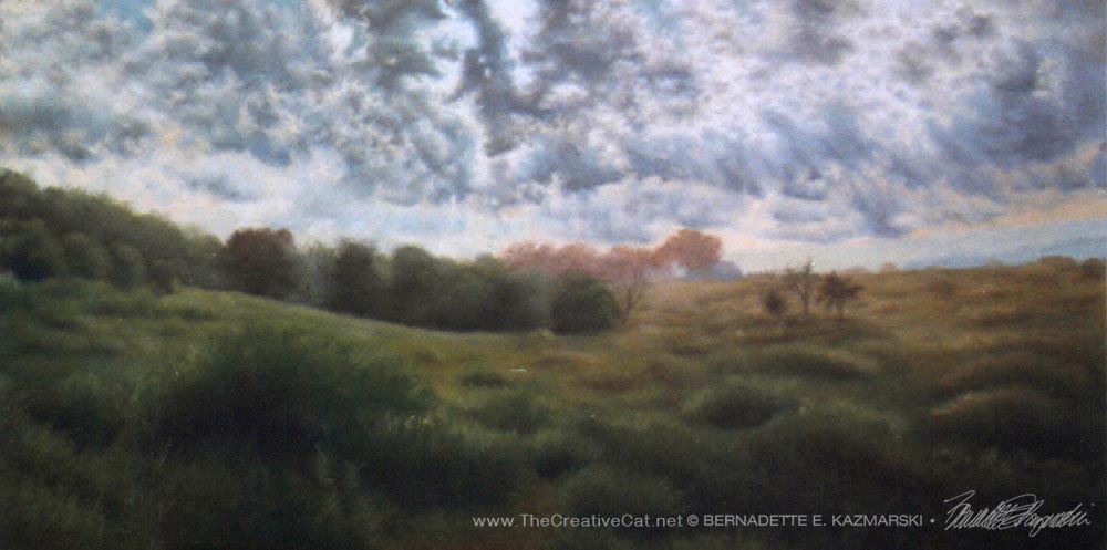
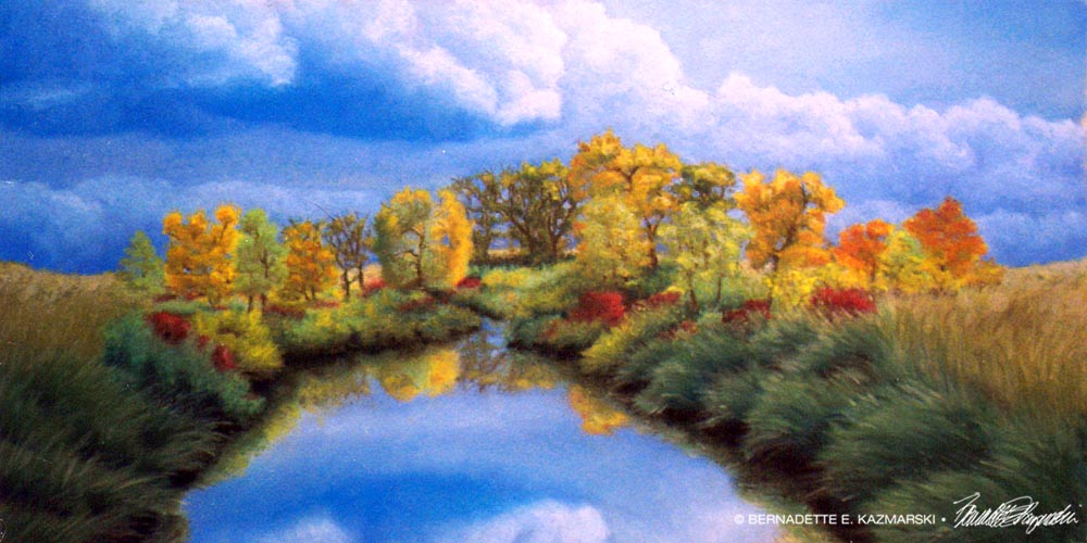
“Autumn” is a hay field with a rambling little stream and scrubby trees as autumn rain clouds roll in which I had photographed along one of the back roads I enjoyed. She had an old farm pond on her property and though her land was hilly I wanted to include a pond somehow.
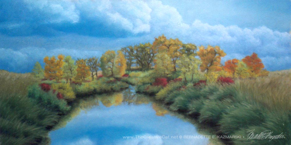
“Autumn”, pastel, 12″ x 24″, 1997 © B.E. Kazmarski
Winter is represented by the frozen hillsides of a farm drifted with snow and reflecting the colors of a winter sunset. The quiet, stillness and subtle color, the snow drifted up against the fencelines in the distance and caught on the clumps of flattened grasses and brush in the fields, the flat sky reflecting the glow of the sun now gone, are all visions that I associate with winter. Even when you don’t see the wind pushing and drifting the snow, you can see the effect in the drift as it is shaped and carved by an unseen hand, and other areas, scoured clean of all but a dusting and left to freeze.
This photograph was taken by a friend of mine who lives on this working dairy farm that I visited when I began painting en plein air. I found this frozen, still sunset absolutely beautiful, the quiet of the empty fields and big open sky, the sound of the wind, the sky gently fading to violet and the windrows and fences marking off the edges of the fields, like a quilt, each angle catching a different shade of fading light.

“Winter”, pastel, 12″ x 24″, 1997 © B.E. Kazmarski
The one interesting part of this quartet is something I did not plan at all, but happened as I put the paintings together. If you let your eye run from one to the next you’ll notice that the horizon line is consistent from one to the next, and the time of day is actually progressive with “Spring” being very early morning, “Summer” about noon, “Autumn” mid afternoon, and “Winter” at sunset. When I saw this developing as I planned the paintings I found I could actually match up the horizon lines, but the times of day were part of the scenes I’d chosen. I had first considered actually having the seasons and times of day blend into one another, but decided the frame really wouldn’t accommodate that convincingly, instead letting the viewer’s eye fill in the connections.
Prints available of these paintings
Each is a nice painting individually, and together they make a wonderful display of canvas prints, whether at the smaller size or full size.
Other items with the same art or design To find all items on this site with the same art or design, use the search box for the name of the artwork and you'll find all that's available.
![]()
![]() Don’t miss any new items or opportunities!
Don’t miss any new items or opportunities!
“Follow” the Portraits of Animals blog with the link in the upper left. Sign up to receive posts in email, or in your favorite reader using the links in the right-hand column.
Sign up for e-newsletters
You can also sign up for my monthly e-newsletters to receive special discounts and find out where I’ll be with my artwork.
Click here for the Creative Cat Preview E-newsletter, for feline and animal-specific products and information.
Click here for the Art & Merchandise E-newsletter, for landscapes, nature, urban scenes and more.
For art, photos and writing as I develop it, visit my blogs.
See feline art and photos as they happen on The Creative Cat, along with feline news, health, welfare, rescue stories and more.
See daily photos as I post them on Today.
Read poetry, short stories, essays and more on Paths I Have Walked.
. . . . . . .
© 2016-2026 | www.PortraitsOfAnimals.net | Published by Bernadette E. Kazmarski
All images used on this site are copyrighted to Bernadette E. Kazmarski unless otherwise noted and may not be used without my written permission. Please ask if you are interested in using one in a print or internet publication. If you are interested in purchasing a print of this image or a product including this image, check to see if I have it available already. If you don’t find it there, visit “purchasing” for availability and terms.
Autumn is 12″ x 24″, and though the original is sold I offer a variety of prints on canvas or paper.
ABOUT THE ARTWORK
“Autumn”, pastel, 12″ x 24″, 1997 © B.E. Kazmarski
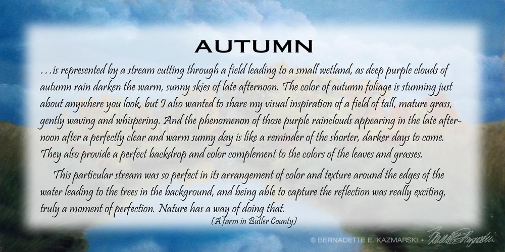
“Autumn” is a pond and stream in a farm field which I saw along the highway. The sky wasn’t as dramatic, so I enhanced it to include those heavy purple rain clouds of September.
Autumn is one of a quartet of paintings, “The Four Seasons”, commissioned to fit a special handmade frame. Scroll down to read about the creation of “The Four Seasons”.
SHIPPING
Shipping within the US is included in all the prices listed. All shipping is via Priority Mail. Prints are shipped flat in a rigid envelope. Canvases are shipped in a box to fit with padding. Since this original is small it is also shipped in a box with extra padding.
ORIGINAL PAINTING
The painting is 23″ x 16″, matted with a deep forest green watered silk acid-free mat edged with a dull gold rounded fillet, framed in a 2″ wood frame with two tones of antique silver edged with antique gold, outside edge finished in deep cherry mahogany.
GICLEE PRINTS
The giclees are printed on acid-free hot press art paper for a smooth matte finish using archival inks. Giclee is the highest quality print available because the technique uses a dozen or more ink ports to capture all the nuances of the original painting, including details of the texture, far more sensitive than any other printing medium. Sometimes my giclees look so much like my originals that even I have a difficult time telling them apart when they are in frames. The giclees have 2″ of white around the outside edges.
I don’t keep giclee prints in stock for most of my works. Usually I have giclees printed as they are ordered unless I have an exhibit where I’ll be selling a particular print so there is a wait of up to two weeks before receipt of your print to allow for time to print and ship.
DIGITAL PRINTS
Digital prints are made on acid-free matte-finish natural white 100# cover using archival digital inks. While digital prints are not the quality of a giclee in capturing every nuance and detail of color, texture and shading, I am still very pleased with the outcome and usually only I as the artist, could tell where detail and color were not as sharp as the original.
The 5″ x 7″ and 8″ x 10″ digital prints are centered on 8.5″ x 11″ digital cover while the 11″ x 14″ has 1″ around the edges because the digital paper is 12″ wide. All are countersigned by me.
CANVAS PRINTS
I usually have at least one of the smaller sizes of canvases on hand, but order larger ones as they are ordered here because customers often want a custom size. Smaller canvases are a 3/4″ in depth, Canvases 12 x 16 and larger are 1-1/2″ in depth. I set them up so the image runs from edge to edge, then the sides are black or white or sometimes I slip in a color that coordinates with the painting.
About “The Four Seasons”
“The Four Seasons” © Bernadette E. Kazmarksi
Years ago a patron of a gallery in Carnegie where I hung my artwork asked me to paint four images for a very special frame she had.
The frame had been designed and handmade in wood by her father-in-law, was long and narrow, and had four openings, each 12″ high by 24″ wide. Each opening had its own piece of glass, and between each opening was a 1/2″ slat of wood as a divider. The outside border of the frame was 2″ wide and flat with hand carved figures which I believe were leaves, like a vine. Overall it had a warm and rustic appearance.
The frame came apart in the center so that there were two panels in each half, and art and glass slid in and out through this opening. The area for the artwork was barely deep enough for a piece of drawing paper, so he must have intended it for photos when he designed it. The frame locked together in the back so that the two halves held together and hung on the wall without sagging.
She was interested in pastel drawings on paper, which were a good choice for this since even flat painting panels would not have fit.
As soon as she described the frame to me I thought of painting the four seasons, in part because of the four sections of the frame, and it’s also a theme I enjoy here in Western Pennsylvania. The customer would enjoy it too, because I’d been to her house and large picture windows were placed to enjoy the landscape from all angles, and the view of the countryside was something she always mentioned.
So I collected reference photos from my rambles for each of the seasons, thinking purely of landscapes. Skies are one of my favorite daily studies, no matter the season; I could watch skies forever, the clouds moving, the changing light. Choosing the right moment of sky to paint into a landscape is a very serious choice for me, as you’ll see in looking at all four paintings in this series.
But she loved white cats and had actually purchased my painting “A Warm Bath” featuring my Angora cat Sally in a bath in morning sun at my side window, and asked me to add a white cat in somewhere since she’d given that painting as a gift. I really considered the best way to include a cat in the first panel, “Spring”. The scenes of the landscapes were typical of landscape paintings, showing the middle and far distance, where a cat would be hard to spot. For the landscape itself I remembered the layout of her yard and acreage, and collected some of my favorite photos of spring blooming garden.
But I remembered one of her picture windows and a countertop that extended partway in front of it and decided what I’d do. I had taken several reference photos of Sally having a good bath in front of that window for “A Warm Bath” and chose a more upright posture where she appeared to be looking out the window. The cat looking out the window in the first painting would also lend the idea that you were looking out the window at all the landscapes.
In this painting of spring I chose a misty moment in early morning, it’s rained overnight, all is covered with raindrops and the mist is still rising, the clouds parting.
Spring
While “Spring” is based on the customer’s property, the other three are not only treasured landscapes but also have emotional ties to the cats in my life.
“Autumn” is a hay field with a rambling little stream and scrubby trees as autumn rain clouds roll in which I had photographed along one of the back roads I enjoyed. She had an old farm pond on her property and though her land was hilly I wanted to include a pond somehow.
“Autumn”, pastel, 12″ x 24″, 1997 © B.E. Kazmarski
And “Winter” is a winter view of the friend’s family farm that I visited when I began painting en plein air. I found this frozen, still sunset absolutely beautiful, the quiet of the empty fields and big open sky, the sound of the wind.
“Winter”, pastel, 12″ x 24″, 1997 © B.E. Kazmarski
The one interesting part of this quartet is something I did not plan at all, but happened as I put the paintings together. If you let your eye run from one to the next you’ll notice that the horizon line is consistent from one to the next, and the time of day is actually progressive with “Spring” being very early morning, “Summer” about noon, “Autumn” mid afternoon, and “Winter” at sunset. When I saw this developing as I planned the paintings I found I could actually match up the horizon lines, but the times of day were part of the scenes I’d chosen. I had first considered actually having the seasons and times of day blend into one another, but decided the frame really wouldn’t accommodate that convincingly, instead letting the viewer’s eye fill in the connections.
Prints available of these paintings
Each is a nice painting individually, and together they make a wonderful display of canvas prints, whether at the smaller size or full size.
Other items with the same art or design To find all items on this site with the same art or design, use the search box for the name of the artwork and you'll find all that's available.
![]()
![]() Don’t miss any new items or opportunities!
Don’t miss any new items or opportunities!
“Follow” the Portraits of Animals blog with the link in the upper left. Sign up to receive posts in email, or in your favorite reader using the links in the right-hand column.
Sign up for e-newsletters
You can also sign up for my monthly e-newsletters to receive special discounts and find out where I’ll be with my artwork.
Click here for the Creative Cat Preview E-newsletter, for feline and animal-specific products and information.
Click here for the Art & Merchandise E-newsletter, for landscapes, nature, urban scenes and more.
For art, photos and writing as I develop it, visit my blogs.
See feline art and photos as they happen on The Creative Cat, along with feline news, health, welfare, rescue stories and more.
See daily photos as I post them on Today.
Read poetry, short stories, essays and more on Paths I Have Walked.
. . . . . . .
© 2016-2026 | www.PortraitsOfAnimals.net | Published by Bernadette E. Kazmarski
All images used on this site are copyrighted to Bernadette E. Kazmarski unless otherwise noted and may not be used without my written permission. Please ask if you are interested in using one in a print or internet publication. If you are interested in purchasing a print of this image or a product including this image, check to see if I have it available already. If you don’t find it there, visit “purchasing” for availability and terms.
Summer is 12″ x 24″, and though the original is sold I offer a variety of prints on canvas or paper.
ABOUT THE ARTWORK
Summer
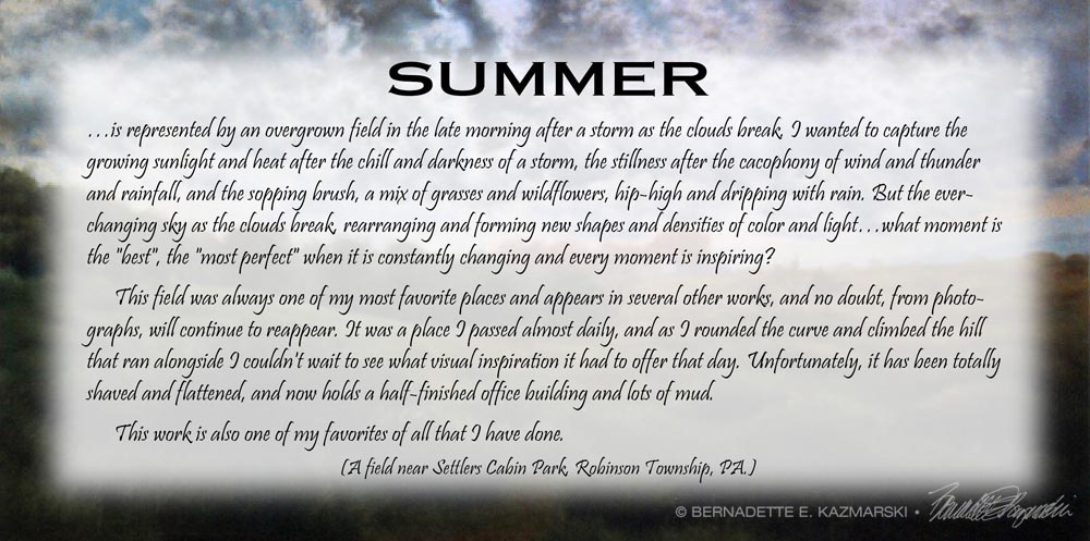
“Summer” is an abandoned farm field on a high ridge which I passed regularly on the way to work each morning for six years, seen right after an early morning storm. I would reach this portion of my drive and drive slowly on the stretch of road to look at this field with the morning unfolding above it, different each day, take a deep breath, and go on. The site was developed a few years later, but I still remember that each time I pass by it, even now.
Summer is one of a quartet of paintings, “The Four Seasons”, commissioned to fit a special handmade frame. Scroll down to read about the creation of “The Four Seasons”.
SHIPPING
Shipping within the US is included in all the prices listed. All shipping is via Priority Mail. Prints are shipped flat in a rigid envelope. Canvases are shipped in a box to fit with padding. Since this original is small it is also shipped in a box with extra padding.
ORIGINAL PAINTING
The painting is 23″ x 16″, matted with a deep forest green watered silk acid-free mat edged with a dull gold rounded fillet, framed in a 2″ wood frame with two tones of antique silver edged with antique gold, outside edge finished in deep cherry mahogany.
GICLEE PRINTS
The giclees are printed on acid-free hot press art paper for a smooth matte finish using archival inks. Giclee is the highest quality print available because the technique uses a dozen or more ink ports to capture all the nuances of the original painting, including details of the texture, far more sensitive than any other printing medium. Sometimes my giclees look so much like my originals that even I have a difficult time telling them apart when they are in frames. The giclees have 2″ of white around the outside edges.
I don’t keep giclee prints in stock for most of my works. Usually I have giclees printed as they are ordered unless I have an exhibit where I’ll be selling a particular print so there is a wait of up to two weeks before receipt of your print to allow for time to print and ship.
DIGITAL PRINTS
Digital prints are made on acid-free matte-finish natural white 100# cover using archival digital inks. While digital prints are not the quality of a giclee in capturing every nuance and detail of color, texture and shading, I am still very pleased with the outcome and usually only I as the artist, could tell where detail and color were not as sharp as the original.
The 5″ x 7″ and 8″ x 10″ digital prints are centered on 8.5″ x 11″ digital cover while the 11″ x 14″ has 1″ around the edges because the digital paper is 12″ wide. All are countersigned by me.
CANVAS PRINTS
I usually have at least one of the smaller sizes of canvases on hand, but order larger ones as they are ordered here because customers often want a custom size. Smaller canvases are a 3/4″ in depth, Canvases 12 x 16 and larger are 1-1/2″ in depth. I set them up so the image runs from edge to edge, then the sides are black or white or sometimes I slip in a color that coordinates with the painting.
About “The Four Seasons”
“The Four Seasons” © Bernadette E. Kazmarksi
Years ago a patron of a gallery in Carnegie where I hung my artwork asked me to paint four images for a very special frame she had.
The frame had been designed and handmade in wood by her father-in-law, was long and narrow, and had four openings, each 12″ high by 24″ wide. Each opening had its own piece of glass, and between each opening was a 1/2″ slat of wood as a divider. The outside border of the frame was 2″ wide and flat with hand carved figures which I believe were leaves, like a vine. Overall it had a warm and rustic appearance.
The frame came apart in the center so that there were two panels in each half, and art and glass slid in and out through this opening. The area for the artwork was barely deep enough for a piece of drawing paper, so he must have intended it for photos when he designed it. The frame locked together in the back so that the two halves held together and hung on the wall without sagging.
She was interested in pastel drawings on paper, which were a good choice for this since even flat painting panels would not have fit.
As soon as she described the frame to me I thought of painting the four seasons, in part because of the four sections of the frame, and it’s also a theme I enjoy here in Western Pennsylvania. The customer would enjoy it too, because I’d been to her house and large picture windows were placed to enjoy the landscape from all angles, and the view of the countryside was something she always mentioned.
So I collected reference photos from my rambles for each of the seasons, thinking purely of landscapes. Skies are one of my favorite daily studies, no matter the season; I could watch skies forever, the clouds moving, the changing light. Choosing the right moment of sky to paint into a landscape is a very serious choice for me, as you’ll see in looking at all four paintings in this series.
But she loved white cats and had actually purchased my painting “A Warm Bath” featuring my Angora cat Sally in a bath in morning sun at my side window, and asked me to add a white cat in somewhere since she’d given that painting as a gift. I really considered the best way to include a cat in the first panel, “Spring”. The scenes of the landscapes were typical of landscape paintings, showing the middle and far distance, where a cat would be hard to spot. For the landscape itself I remembered the layout of her yard and acreage, and collected some of my favorite photos of spring blooming garden.
But I remembered one of her picture windows and a countertop that extended partway in front of it and decided what I’d do. I had taken several reference photos of Sally having a good bath in front of that window for “A Warm Bath” and chose a more upright posture where she appeared to be looking out the window. The cat looking out the window in the first painting would also lend the idea that you were looking out the window at all the landscapes.
In this painting of spring I chose a misty moment in early morning, it’s rained overnight, all is covered with raindrops and the mist is still rising, the clouds parting.
Spring
While “Spring” is based on the customer’s property, the other three are not only treasured landscapes but also have emotional ties to the cats in my life.
“Autumn” is a hay field with a rambling little stream and scrubby trees as autumn rain clouds roll in which I had photographed along one of the back roads I enjoyed. She had an old farm pond on her property and though her land was hilly I wanted to include a pond somehow.
“Autumn”, pastel, 12″ x 24″, 1997 © B.E. Kazmarski
And “Winter” is a winter view of the friend’s family farm that I visited when I began painting en plein air. I found this frozen, still sunset absolutely beautiful, the quiet of the empty fields and big open sky, the sound of the wind.
“Winter”, pastel, 12″ x 24″, 1997 © B.E. Kazmarski
The one interesting part of this quartet is something I did not plan at all, but happened as I put the paintings together. If you let your eye run from one to the next you’ll notice that the horizon line is consistent from one to the next, and the time of day is actually progressive with “Spring” being very early morning, “Summer” about noon, “Autumn” mid afternoon, and “Winter” at sunset. When I saw this developing as I planned the paintings I found I could actually match up the horizon lines, but the times of day were part of the scenes I’d chosen. I had first considered actually having the seasons and times of day blend into one another, but decided the frame really wouldn’t accommodate that convincingly, instead letting the viewer’s eye fill in the connections.
Prints available of these paintings
Each is a nice painting individually, and together they make a wonderful display of canvas prints, whether at the smaller size or full size.
Other items with the same art or design To find all items on this site with the same art or design, use the search box for the name of the artwork and you'll find all that's available.
![]()
![]() Don’t miss any new items or opportunities!
Don’t miss any new items or opportunities!
“Follow” the Portraits of Animals blog with the link in the upper left. Sign up to receive posts in email, or in your favorite reader using the links in the right-hand column.
Sign up for e-newsletters
You can also sign up for my monthly e-newsletters to receive special discounts and find out where I’ll be with my artwork.
Click here for the Creative Cat Preview E-newsletter, for feline and animal-specific products and information.
Click here for the Art & Merchandise E-newsletter, for landscapes, nature, urban scenes and more.
For art, photos and writing as I develop it, visit my blogs.
See feline art and photos as they happen on The Creative Cat, along with feline news, health, welfare, rescue stories and more.
See daily photos as I post them on Today.
Read poetry, short stories, essays and more on Paths I Have Walked.
. . . . . . .
© 2016-2026 | www.PortraitsOfAnimals.net | Published by Bernadette E. Kazmarski
All images used on this site are copyrighted to Bernadette E. Kazmarski unless otherwise noted and may not be used without my written permission. Please ask if you are interested in using one in a print or internet publication. If you are interested in purchasing a print of this image or a product including this image, check to see if I have it available already. If you don’t find it there, visit “purchasing” for availability and terms.
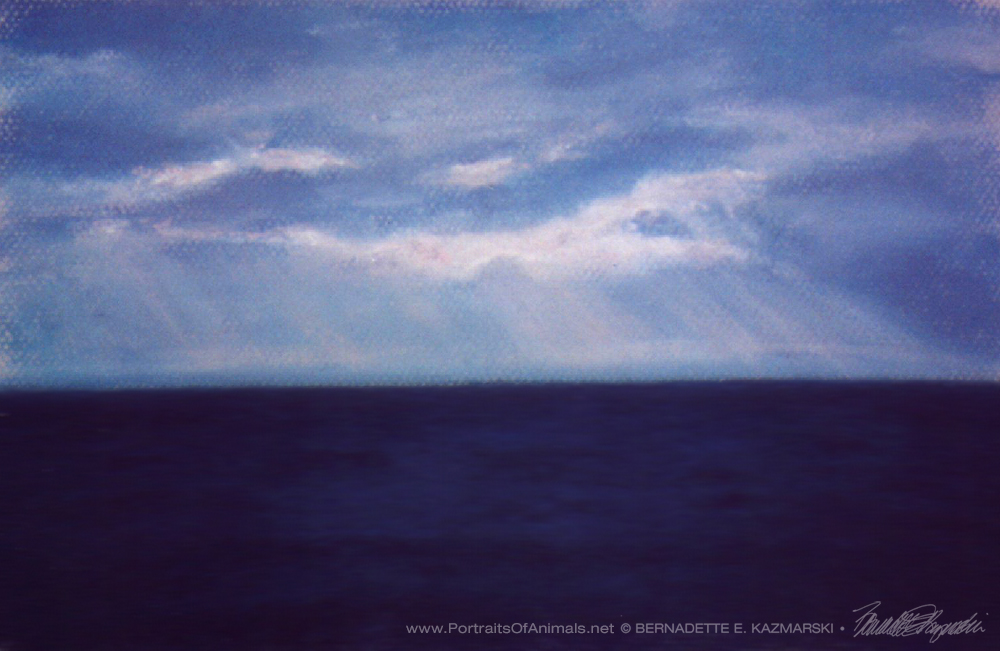
The Silent Lake, pastel, is a scene on Lake Erie from Presque Isle in Erie, PA, The original was 7″ x 10″, painted in 1999, available in three sizes and styles of prints.
The Silent Lake, pastel, 7″ x 10″, 1999 © Bernadette E. Kazmarski
ABOUT THE ARTWORK
The sunset struggled through a broken cloud cover for about an hour and a half, providing an ever-changing light show as it changed color and sent rays of light down to the lake in random patterns. The lake, so still and quiet and dark, had such presence, and seemed like a solid land mass instead of a fluid body.
SHIPPING AND CHARGES
Shipping within the US is included in the cost of each print.
Prints up to 16″ x 20″ are shipped flat in a rigid envelope. Larger prints are shipped rolled in a mailing tube unless otherwise requested; flat shipping is an extra cost because it’s oversized.
Other items with the same art or design To find all items on this site with the same art or design, use the search box for the name of the artwork and you'll find all that's available.![]()
![]() Don’t miss any new items or opportunities!
Don’t miss any new items or opportunities!
“Follow” the Portraits of Animals blog with the link in the upper left. Sign up to receive posts in email, or in your favorite reader using the links in the right-hand column.
Sign up for e-newsletters
You can also sign up for my monthly e-newsletters to receive special discounts and find out where I’ll be with my artwork.
Click here for the Creative Cat Preview E-newsletter, for feline and animal-specific products and information.
Click here for the Art & Merchandise E-newsletter, for landscapes, nature, urban scenes and more.
For art, photos and writing as I develop it, visit my blogs.
See feline art and photos as they happen on The Creative Cat, along with feline news, health, welfare, rescue stories and more.
See daily photos as I post them on Today.
Read poetry, short stories, essays and more on Paths I Have Walked.
. . . . . . .
© 2016-2026 | www.PortraitsOfAnimals.net | Published by Bernadette E. Kazmarski
All images used on this site are copyrighted to Bernadette E. Kazmarski unless otherwise noted and may not be used without my written permission. Please ask if you are interested in using one in a print or internet publication. If you are interested in purchasing a print of this image or a product including this image, check to see if I have it available already. If you don’t find it there, visit “purchasing” for availability and terms.

Spring is 12″ x 24″, and though the original is sold but I offer a variety of prints on canvas or paper.
ABOUT THE ARTWORK
-
- “Spring”, pastel, 12″ x 24″, 1998 © Bernadette E. Kazmarski
-

- Spring, detail.
-
- A portion to fit into a standard image size.
This painting is 12″ x 24″, and I offer dimensional canvases and full-size giclee prints, but I also offer a cropped version that fits into standard frame sizes and captures the left side of the painting only. Below is the story of the painting.
Years ago a patron of a gallery in Carnegie where I hung my artwork asked me to paint four images for a very special frame she had.
It had been designed and handmade in wood by her father-in-law, long and narrow, and had four openings, each 12″ high by 24″ wide. Each opening had its own piece of glass, and between each opening was a 1/2″ slat of wood as a divider. The outside border of the frame was 2″ wide and flat with hand carved figures which I believe were leaves, like a vine. Overall it had a warm and rustic appearance.
The frame came apart in the center so that there were two panels in each half, and art and glass slid in and out through this opening. The area for the artwork was barely deep enough for a piece of drawing paper, so he must have intended it for photos when he designed it. The frame locked together in the back so that the two halves held together and hung on the wall without sagging.
She was interested in pastel drawings on paper, which were a good choice for this since even flat painting panels would not have fit.
As soon as she described the frame to me I thought of painting the four seasons, in part because of the four sections of the frame, and it’s also a theme I enjoy here in Western Pennsylvania. The customer would enjoy it too, because I’d been to her house and large picture windows were placed to enjoy the landscape from all angles, and the view of the countryside was something she always mentioned.
So I collected reference photos from my rambles for each of the seasons, thinking purely of landscapes. But she loved white cats and had actually purchased my painting “A Warm Bath” featuring my Angora cat Sally in a bath in morning sun at my side window, and asked me to add a white cat in somewhere since she’d given that painting as a gift.
A Warm Bath, pastel, 12″ x 10″, 1997 © Bernadette E. Kazmarski
I really considered the best way to show this. The scenes of the landscapes were typical of landscape paintings, showing the middle and far distance, where a cat would be hard to spot. But I remembered one of her picture windows and a countertop that extended partway in front of it and decided what I’d do.
I had taken several reference photos of Sally having a good bath in front of that window for “A Warm Bath”, and chose the pose I actually painted because you could still see Sally’s face, though she was looking down. Photographing a cat in the process of a bath, white or black or striped or spotted, was no easier then than it is now except that I didn’t know what I hadn’t caught until I had the photos developed. Most of the photos were when Sally had her back turned, but in this case, in the more upright posture, she appeared to be looking out the window, also typical of her and other cats positioned on such a shelf in front of a picture window. The cat looking out the window in the first painting would also lend the idea that you were looking out the window at all the landscapes.
To add to the interior I decided to use another detail that may look familiar to some regular readers of The Creative Cat, the draped lace curtain from the window on the second floor landing of my house. It’s quite clear in several of the photos I posted from 1994 as well as many photos of cats today, literally. In part I chose it for its own pattern and the natural appearance of a lace curtain next to a window, and also to balance the detail and pattern in the landscape outside the window.
Fawn on the windowsill with the lace curtain.
I was glad to draw Sally’s dreamy white fur again as well as the sun and shadow on the wall inside the window, and looked forward to the lace curtain because I’d not painted one before and had been looking for a reason to add one to a painting, determining how much detail I’d actually include and how I’d do it in pastel.
“Spring” detail of cat and curtain; sorry for the poor resolution if you are seeing this 1000 pixels wide.
I apologize for the slight blur in the photos of this painting; it’s as clear and sharp as other finely detailed paintings I’ve done, and while I’ve been able to rephotograph older works by visiting the customer, because of the nature of this frame and the difficulty in handling it, we haven’t been able to do so yet. But reference “A Warm Bath”, above, for the style and level of detail.
For the landscape itself I remembered the layout of her yard and acreage, and collected some of my favorite photos of spring blooming gardens; in the end I toned down the rhododendrons and daffodils. But skies are one of my favorite daily studies, no matter the season; I could watch skies forever, the clouds moving, the changing light. Choosing the right moment of sky to paint into a landscape is a very serious choice for me, as you’ll see in looking at all four paintings in this series. In this painting of spring I chose a misty moment in early morning, it’s rained overnight, all is covered with raindrops and the mist is still rising, the clouds parting.
Here are the other three seasons in order, “Summer”, “Autumn” and “Winter”, and I’ll also point out a few correlations to the overall composition of the set a little later.
While “Spring” is based on the customer’s property, the other three are not only treasured landscapes but also have emotional ties to the cats in my life. “Summer” is an abandoned farm field on a high ridge which I passed regularly on the way to work each morning for six years, seen right after an early morning storm. I remember in the last few months Kublai was with me I hated to leave him every day and I would reach this portion of my drive and pause to look at this field with the morning unfolding above it, different each day, take a deep breath, and go on. The site was developed a few years later, but I still remember that each time I pass by it, even now.
“Summer”, pastel, 12″ x 24″, 1997 © B.E. Kazmarski
“Autumn” is a hay field with a rambling little stream and scrubby trees as autumn rain clouds roll in which I saw along a road and went to explore during that October after I’d lost both boys.
“Autumn”, pastel, 12″ x 24″, 1997 © B.E. Kazmarski
And “Winter” is a winter view of the friend’s family farm that I visited during that November to paint and find peace in the quiet of the empty fields and big open sky, the sound of the wind.
“Winter”, pastel, 12″ x 24″, 1997 © B.E. Kazmarski
If you let your eye run from one to the next you’ll notice that the horizon line is consistent from one to the next, and the time of day is actually progressive with “Spring” being very early morning, “Summer” about noon, “Autumn” mid afternoon, and “Winter” at sunset. I had first considered actually having the seasons and times of day blend into one another, but decided the frame really wouldn’t accommodate that convincingly, instead letting the viewer’s eye fill in the connections. One of these days she and I will get together so I can take good updated photographs of all four seasons.
“The Four Seasons” © Bernadette E. Kazmarksi
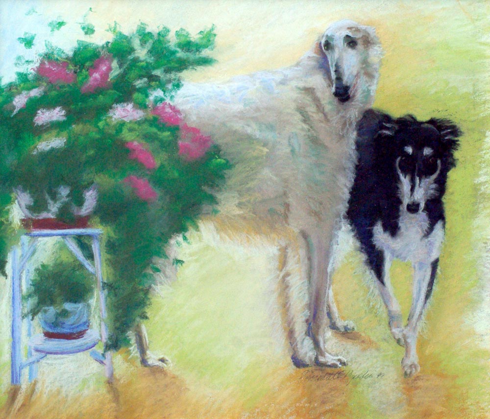
“Borzois”, pastel, 20″ x 26″ © Bernadette E. Kazmarski
This woman is also the one I’d painted the two portraits of the borzois, and while I have the one original of the one on the left and have taken a good clear photograph of it, I’d love to get the details of the other one as well.
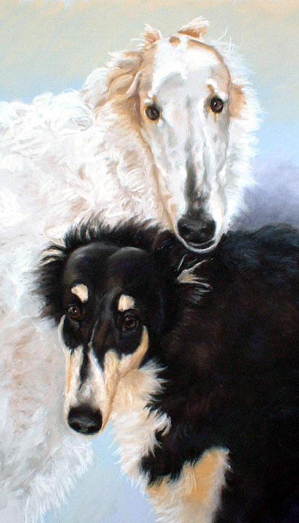
“Traveler and Emma”, pastel, 12″ x 21″ © Bernadette E. Kazmarski
Read articles on The Creative Cat featuring current and past commissioned portraits.
Read about how I create commissioned portraits.
SHIPPING
Shipping within the US is included in all the prices listed. All shipping is via Priority Mail. Prints are shipped flat in a rigid envelope. Canvases are shipped in a box to fit with padding. Since this original is small it is also shipped in a box with extra padding.
ORIGINAL PAINTING
The painting is 23″ x 16″, matted with a deep forest green watered silk acid-free mat edged with a dull gold rounded fillet, framed in a 2″ wood frame with two tones of antique silver edged with antique gold, outside edge finished in deep cherry mahogany.
GICLEE PRINTS
The giclees are printed on acid-free hot press art paper for a smooth matte finish using archival inks. Giclee is the highest quality print available because the technique uses a dozen or more ink ports to capture all the nuances of the original painting, including details of the texture, far more sensitive than any other printing medium. Sometimes my giclees look so much like my originals that even I have a difficult time telling them apart when they are in frames. The giclees have 2″ of white around the outside edges.
I don’t keep giclee prints in stock for most of my works. Usually I have giclees printed as they are ordered unless I have an exhibit where I’ll be selling a particular print so there is a wait of up to two weeks before receipt of your print to allow for time to print and ship.
DIGITAL PRINTS
Digital prints are made on acid-free matte-finish natural white 100# cover using archival digital inks. While digital prints are not the quality of a giclee in capturing every nuance and detail of color, texture and shading, I am still very pleased with the outcome and usually only I as the artist, could tell where detail and color were not as sharp as the original.
The 5″ x 7″ and 8″ x 10″ digital prints are centered on 8.5″ x 11″ digital cover while the 11″ x 14″ has 1″ around the edges because the digital paper is 12″ wide. All are countersigned by me.
CANVAS PRINTS
I usually have at least one of the smaller sizes of canvases on hand, but order larger ones as they are ordered here because customers often want a custom size. Smaller canvases are a 3/4″ in depth, Canvases 12 x 16 and larger are 1-1/2″ in depth. I set them up so the image runs from edge to edge, then the sides are black or white or sometimes I slip in a color that coordinates with the painting. This canvas is black on the sides.
MOUSEPADS
Mousepads are 8″ x 7″, always horizontal, 1/4″ black foam rubber with the image printed on a flexible fabric on top.
[signoff[

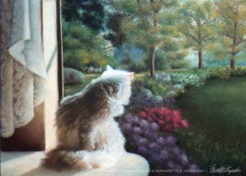
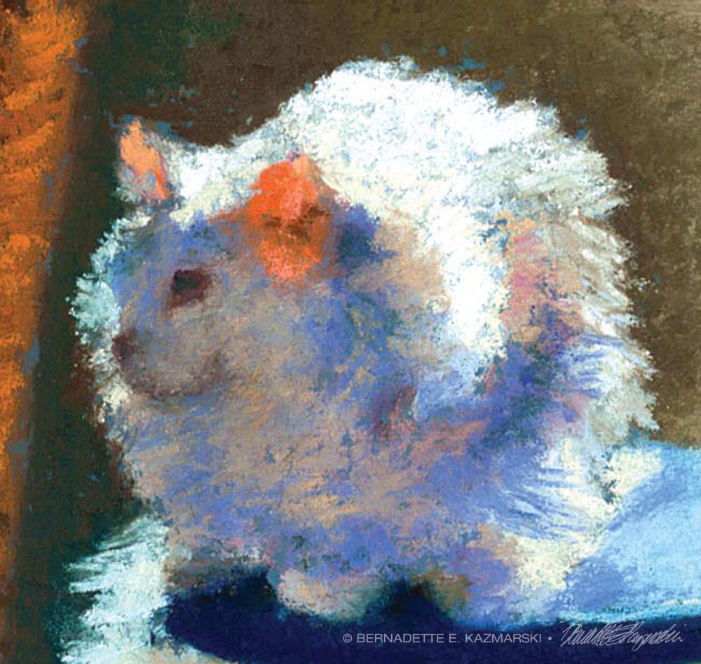
This is an pastel painting, “White Cat Reflecting”, pastel on Hahnemühle sanded watercolor paper, 6″ x 14″© Bernadette E. Kazmarski
About the painting, and Sally
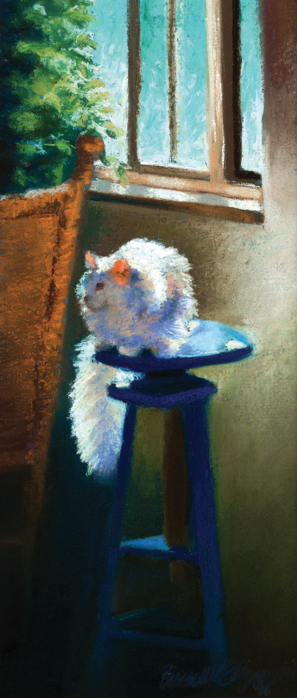
“White Cat Reflecting”, pastel on Hahnemühle sanded watercolor paper, 6″ x 14″© Bernadette E. Kazmarski
My white cat was endlessly inspiring to me, and I would need two lifetimes to recreate all the images of her that I have photographed and saw every day. Sally was deaf and spent most of her days in her own little world in pursuit of her own happiness, which when possible included a rest, nap or long snooze in the sun. Here she alights briefly on the stool, reflecting the sunlight onto all that is around her while she reflects on the events of her day so far and just what is to be done next.
Sometimes a more finished, finely-detailed painting isn’t the best way to capture an animal’s personality, and especially not my capricious little Sally. I also realized I’ve never featured her in a desktop calendar for all I’ve written about her. I believe I painted this in June because that is when the sun comes in the dining room window at this angle, so this June features Sally in all her brilliant colors.
Yes, that is one tall narrow sketch! Sally was so inspiring, all that white fur, all that color within the shadows and highlights. She frequently sat on this stool when the sun came in the window and I’d photographed her there, thinking someday I’d do a painting of her. But this was more or less a daily sketch, starting with actually standing at my easel by the big north window where I used to work, and seeing her there one afternoon. I sketched out the basics on a piece of blue Hahnemühle sanded watercolor paper that was handy, and likely because I was looking through a doorway and anything else in the scene was only distracting, I stopped at this width for the sketch. Narrow compositions are a favorite of mine anyway, vertical or horizontal, and because I wanted to focus on Sally but also wanted to capture the feeling of the light pouring down onto her and the grace of the stool, the tall shape fit the composition well.
I began from life, but Sally didn’t hold still for too long. I had the photos I’d taken in the past that were enough like her position if I put them all together, so, while the vision was still in my mind, I dug them out and began with the visual notes I’d taken in pastel on the paper and used the positioning and highlights and shadows from the photos to continue.
What I wanted to capture most was the sunlight through her ears, her face in muted shadow, colorful shadow from reflected light, silhouetted against her brilliant highlighted fur, and that tail, just spilling down like a trail of mist, I wanted just enough there to get the feeling of the light and color.
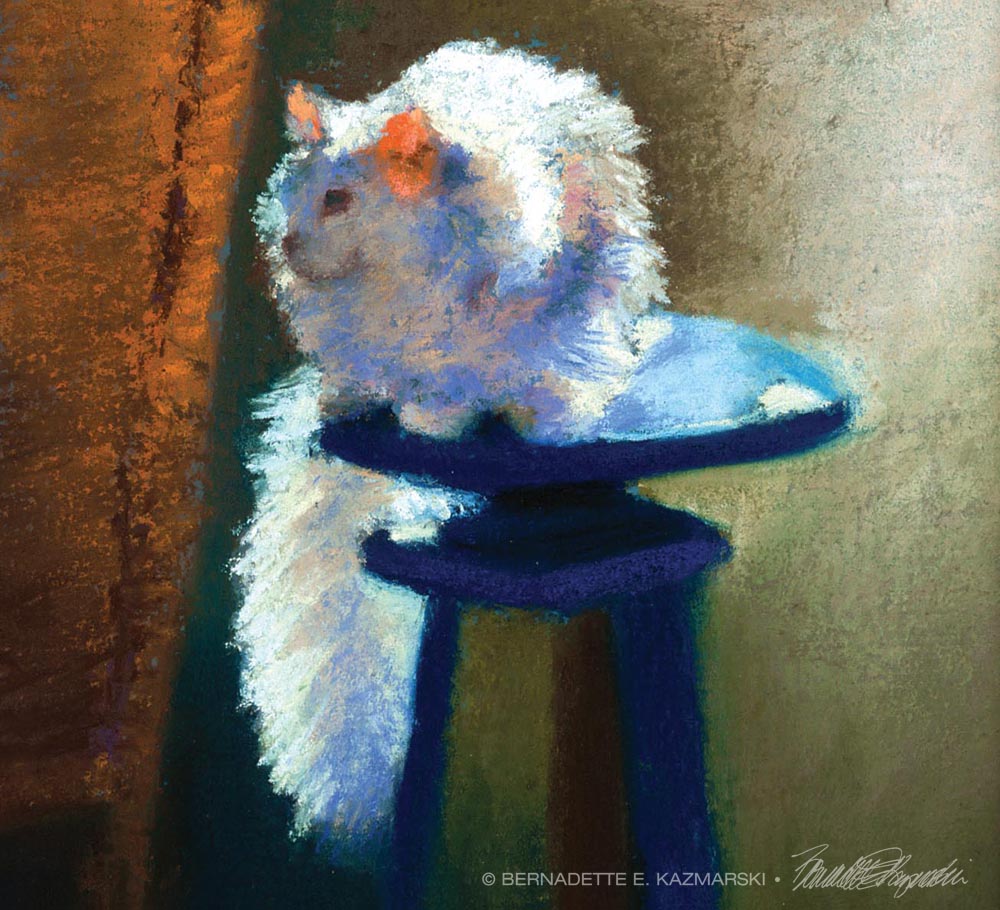
I had been focusing completely on Sally’s beauty, but one of the elements I hadn’t anticipated when I went to work from the photos was Sally’s reflection of light back onto the surfaces around her. When I looked at the spot after she’d moved, it was all dark. The back of the rocker, the wall behind her, I hadn’t realized until I looked at the photos that those areas only had light because it was reflected from her.
Years ago in order to encourage myself to break out of the rectangular shape and one brand of sanded drawing paper, I purchased a number of different pastel drawing papers and materials intended to provide a enough texture to any surface so that it would hold pastel. The usual paper was like very fine sandpaper, about the equivalent of 600 grit finishing sandpaper. Each of these surface materials was different: coarse grit, fine grit, marble dust and a type of gesso, which I applied individually, mixed or layered to scrap drawing paper and matboard. My assignment was to use these materials for sketches and save the usual drawing paper for finished drawings, so they were around the house and went, literally, out into the field with me as I was painting landscapes.
This paper has a rough texture because it’s watercolor paper, and then the fairly coarse sanded finish is added to the texture. I’d also used it for “Bison Shadow” because I wanted to discourage myself from getting caught up in details, I just wanted to rough in the lights and darks and blend the colors, and I did so with this painting as well.
I let little bits of the paper’s native color show through as well, which added to the interest and shading. I like the way the windows and windowsill turned out, above, just enough detail to understand what they were. And below, an exploration of working in deeper shadows while still keeping colors warm and bright.
In all, this sketch captured Sally’s capricious spirit, the ephemeral nature of her beauty around the house. She could be like a walking source of illumination, and it wasn’t entirely because of her coloring. I’m so glad I grabbed this moment and my pastels and paper because I’m sure I would have done something very different if I had gathered the photos and planned out a more finished painting.
Purchasing prints
This painting is included on one set of cards, “Feline Fine Art Cards”. I’ve also applied it to a few gift items, such as coasters and keepsake boxes so check my “Handmade Gifts” page.
SHIPPING
Shipping within the US is included in all the prices listed. All shipping is via Priority Mail. Prints are shipped flat in a rigid envelope. Canvases are shipped in a box to fit with padding. Since this original is small it is also shipped in a box with extra padding.
GICLEE PRINTS
The giclees are printed on acid-free hot press art paper for a smooth matte finish using archival inks. Giclee is the highest quality print available because the technique uses a dozen or more ink ports to capture all the nuances of the original painting, including details of the texture, far more sensitive than any other printing medium. Sometimes my giclees look so much like my originals that even I have a difficult time telling them apart when they are in frames. The giclees have 2″ of white around the outside edges.
I don’t keep giclee prints in stock for most of my works. Usually I have giclees printed as they are ordered unless I have an exhibit where I’ll be selling a particular print so there is a wait of up to two weeks before receipt of your print to allow for time to print and ship.
DIGITAL PRINTS
Digital prints are made on acid-free matte-finish natural white 100# cover using archival digital inks. While digital prints are not the quality of a giclee in capturing every nuance and detail of color, texture and shading, I am still very pleased with the outcome and usually only I as the artist, could tell where detail and color were not as sharp as the original.
The 5″ x 7″ and 8″ x 10″ digital prints are centered on 8.5″ x 11″ digital cover while the 11″ x 14″ has 1″ around the edges because the digital paper is 12″ wide. All are countersigned by me.
CANVAS PRINTS
I usually have at least one of the smaller sizes of canvases on hand, but order larger ones as they are ordered here because customers often want a custom size. Smaller canvases are a 3/4″ in depth, Canvases 12 x 16 and larger are 1-1/2″ in depth. I set them up so the image runs from edge to edge, then the sides are black or white or sometimes I slip in a color that coordinates with the painting. This canvas is black on the sides.
MOUSEPADS
Mousepads are 8″ x 7″, always horizontal, 1/4″ black foam rubber with the image printed on a flexible fabric on top.

The original pastel painting of deserted cottages on a Lake Erie beach in Northeast, PA was 17″ x 8.5″ on Rembrandt pastels on Hahnemuhle sanded watercolor paper. Prints are available.
ABOUT THE ARTWORK
-

- “Deserted Cottages”, 17″ x 8.5″, Rembrandt pastels on Hahnemuhle sanded watercolor paper, 1998 © Bernadette E. Kazmarski
I painted “Deserted Cottages” en plein air at a deserted campground in North East along Lake Erie. It was just a quick thing at the end of the day because the sun was going down and the light was changing fast, but I’d been painting all day and I was well warmed up. I quickly blocked in the buildings with just a few simple shapes and colors and their traceries of shadows, then the trees and grass, trying to catch the fluttering effect of the leaves in the wind allowing chunks of sky to show through, the tree trunks simplified and in high light-dark contrast, the blank expression of the boarded windows. I was pleased with the outcome, yet something was strangely familiar.

The Warfield painting.
Six years later I put my mother’s house up for sale as she had moved to personal care, and took down her collection of cardboard art in plastic frames that I’d studied in depth growing up. It may not have been expensive, but there was a lot of it, in every room, including the basement. I particularly remembered the one long narrow painting with the signature J.E. Warfield because I liked the way the trees were leafy, not solid, and opened to the sky, the shadows traced across the ground and the buildings were very simple; after studying it as a child I felt that I could do that. Again, something was familiar.

Detail of houses.
I looked at “Deserted Cottages”, and looked at my cardboard Warfield. The tree trunks, the leaves, the simply buildings, the shadows—there it was! I could clearly see what I’d been aiming for as I’d painted six years before—this painting I’d been studying all my life practically. So it was a cheap cardboard painting stapled into a rickety wood frame—never underestimate the power of any image to inspire and teach! And I haven’t found out a darned thing about J.E. Warfield, but apparently this painting was a popular one judging by all the ones I see being sold as “vintage”. Perhaps it’s also inspired many others out there.
SHIPPING
Shipping within the US is included in all the prices listed. All shipping is via Priority Mail. Prints are shipped flat in a rigid envelope. Canvases are shipped in a box to fit with padding. Since this original is small it is also shipped in a box with extra padding.
FRAMED ORIGINAL
The framed original is sold.
SIGNED GICLEE PRINTS
The giclees are printed on acid-free hot press art paper for a smooth matte finish using archival inks. Giclee is the highest quality print available because the technique uses a dozen or more ink ports to capture all the nuances of the original painting, including details of the texture, far more sensitive than any other printing medium. Sometimes my giclees look so much like my originals that even I have a difficult time telling them apart when they are in frames.
I don’t keep giclee prints in stock for most of my works. Usually I have giclees printed as they are ordered unless I have an exhibit where I’ll be selling a particular print so there is a wait of up to two weeks before receipt of your print to allow for time to print and ship.
SIGNED DIGITAL PRINTS
Digital prints are made on acid-free matte-finish natural white 100# cover using archival digital inks. While digital prints are not the quality of a giclee in capturing every nuance and detail of color, texture and shading, I am still very pleased with the outcome and usually only I as the artist could tell where detail and color were not as sharp as the original.
SIGNED CANVAS PRINTS
Like giclee prints, I don’t keep canvas prints on hand; at one time they were very popular but not so much lately. No matter how I store or display them in my home gallery or in exhibits or vendor shows, they are easily damaged. I order them as customers order them, and work with two providers, depending on the size of the print, who turn them around quickly.
Other items with the same art or design To find all items on this site with the same art or design, use the search box for the name of the artwork and you'll find all that's available.![]()
![]() Don’t miss any new items or opportunities!
Don’t miss any new items or opportunities!
“Follow” the Portraits of Animals blog with the link in the upper left. Sign up to receive posts in email, or in your favorite reader using the links in the right-hand column.
Sign up for e-newsletters
You can also sign up for my monthly e-newsletters to receive special discounts and find out where I’ll be with my artwork.
Click here for the Creative Cat Preview E-newsletter, for feline and animal-specific products and information.
Click here for the Art & Merchandise E-newsletter, for landscapes, nature, urban scenes and more.
For art, photos and writing as I develop it, visit my blogs.
See feline art and photos as they happen on The Creative Cat, along with feline news, health, welfare, rescue stories and more.
See daily photos as I post them on Today.
Read poetry, short stories, essays and more on Paths I Have Walked.
. . . . . . .
© 2016-2026 | www.PortraitsOfAnimals.net | Published by Bernadette E. Kazmarski
All images used on this site are copyrighted to Bernadette E. Kazmarski unless otherwise noted and may not be used without my written permission. Please ask if you are interested in using one in a print or internet publication. If you are interested in purchasing a print of this image or a product including this image, check to see if I have it available already. If you don’t find it there, visit “purchasing” for availability and terms.
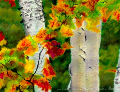
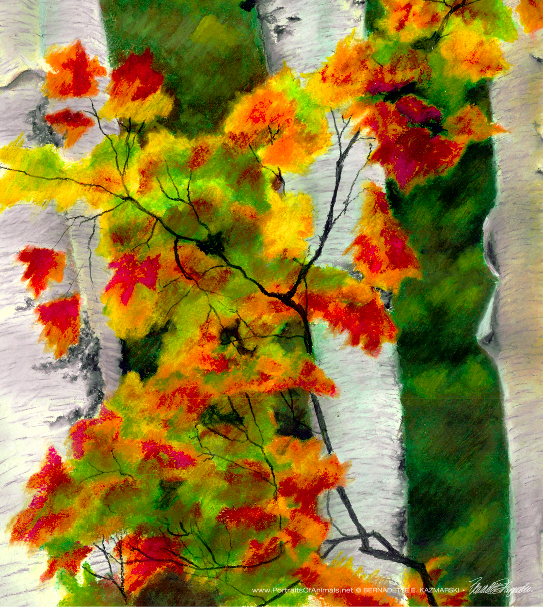
The original of this painting was oil pastel, 24.5″ x 18″, on 300 lb. smooth watercolor paper.
Detail images of Birches 1: Radiance
-
- Birches 1, detail.
-

- Birches 1, detail.
-
- Birches 1, detail.

-

- Birches 1, detail.
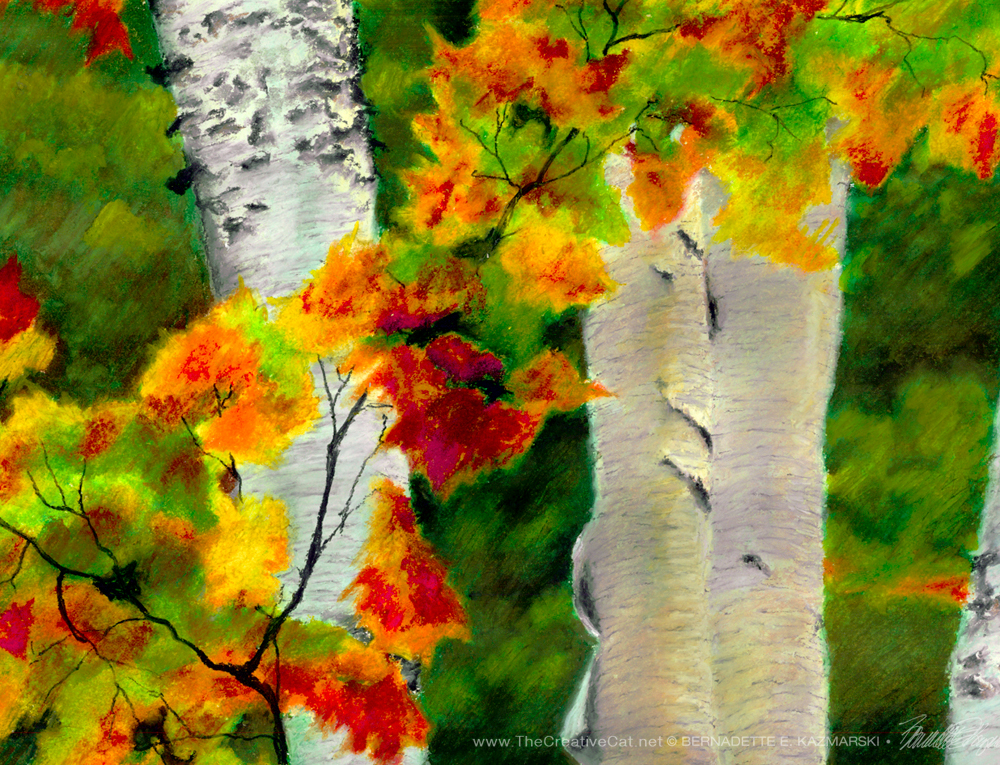
Available prints of Birches 1: Autumn Showers
I offer all sorts of prints on paper and canvas, some of which I have on hand, some of which, like canvas prints and giclee prints, I order when I receive and order for one. To have canvas and giclee prints on hand for all the artwork I have would be a huge investment and also I’d need another house to store it in, not kidding. But with some artwork like this painting I often have at least one framed print and a canvas print or two. In this case I have one of each.
The print is actually 12″ x 15″, smaller than the original, framed with a double white mat in a marbled coppery finish wood frame. It was difficult to photograph and catch the colors correctly but the bottom rail represents the frame color and pattern best. The edges of the mat look like gray but that’s just a shadow from the lighting—both mats are white.
Birches 1, framed print.
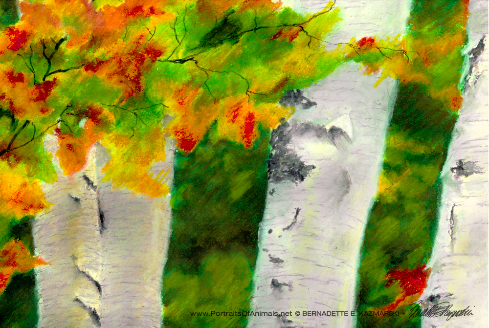
I also have one 16″ x 20″ canvas print, photos below.
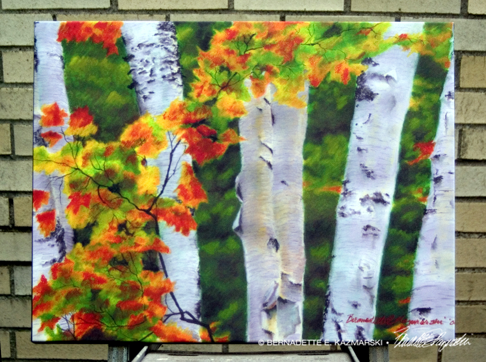
Birches 1, 16″ x 20″ canvas print.
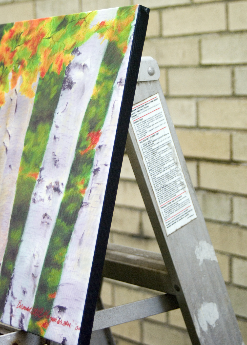
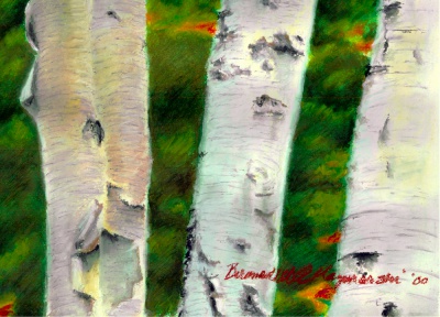
Birches 1, detail of edge.
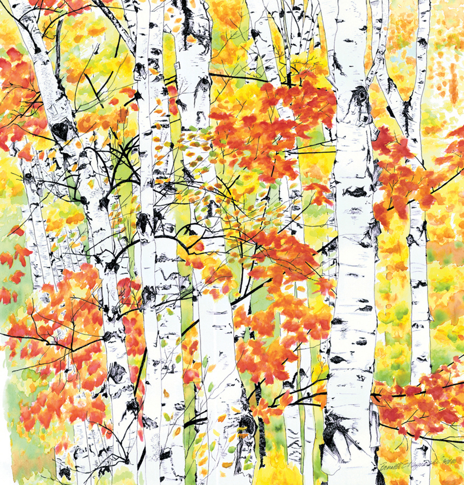
From the time I met the paper birch in our front yard I have always been attracted to the delicately detailed white bark of birch trees which seemed to emit its own faint light in any season. Here, in the darkness of the woods, the grouping of white trunks looks like a crowd clustered for discussion, decorated by a maple branch.
The technique was an experiment borne of an off-hand remark from a fellow artist. I had just been experimenting with oil pastels, which at first felt like slippery crayons but soon grew to have their own life as I understood the best ways to achieve the colors and textures I wanted. The artist friend mentioned that you could also work with them using turpentine, either softening the crayons in it or drawing on the paper, then painting turpentine over the oil pastel to blend or spread. I chose to use a combination of these as well as wetting the paper with the turpentine and drawing on that area with the oil pastel. The resulting painting actually looks dimensional, and I know it’s only because of the different textures in the work.
Also see Birches 2: Radiance.
Birches 2: Radiance, watercolor, 22 x 23, edges cropped.
SHIPPING AND CHARGES
Shipping within the US is included in the cost of each print.
Prints up to 16″ x 20″ are shipped flat in a rigid envelope. Larger prints are shipped rolled in a mailing tube unless otherwise requested; flat shipping is an extra cost because it’s oversized.
GICLEE PRINTS
The giclees are printed on acid-free hot press art paper for a smooth matte finish using archival inks. Giclee is the highest quality print available because the technique uses a dozen or more ink ports to capture all the nuances of the original painting, including details of the texture, far more sensitive than any other printing medium. Sometimes my giclees look so much like my originals that even I have a difficult time telling them apart when they are in frames.
I don’t keep giclee prints in stock for most of my works. Usually I have giclees printed as they are ordered unless I have an exhibit where I’ll be selling a particular print so there is a wait of up to two weeks before receipt of your print to allow for time to print and ship.
DIGITAL PRINTS
Digital prints are made on acid-free matte-finish natural white 100# cover using archival digital inks. While digital prints are not the quality of a giclee in capturing every nuance and detail of color, texture and shading, I am still very pleased with the outcome and usually only I as the artist, could tell where detail and color were not as sharp as the original. Digital prints are only available up to 11″ x 17″ and some of the prints are cropped to fit standard mat and frame sizes.
Digital prints have at least 1/2″ around the edges depending on the size of the print. All are countersigned by me.
CANVAS PRINTS
Because the standard size canvas prints are not proportional to the original painting, canvas prints of this painting will have a portion cropped off.
I usually have at least one of the smaller sizes of canvases on hand, but order larger ones as they are ordered because I have limited storage space. Smaller canvases are a 3/4″ in depth, Canvases 12 x 16 and larger are 1-1/2″ in depth. I set them up so the image runs from edge to edge, then the sides are black or white or sometimes I slip in a color that coordinates with the painting. This canvas is black around the sides.
FRAMED PRINTS
I do all my own framing and can custom frame a print for you. Please ask.

Sunset on the Bay is a watercolor, 24 x 12, painted in 1993. I offer it in three sizes and styles of prints.
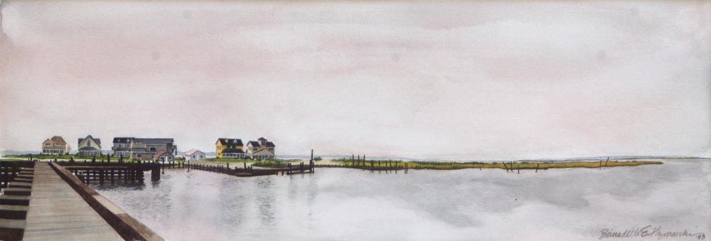
Sunset on the Bay, watercolor, 24 x 18, 1993 © Bernadette E. Kazmarski
-
- Sunset on the Bay, watercolor, 24 x 18, 1993 © Bernadette E. Kazmarski
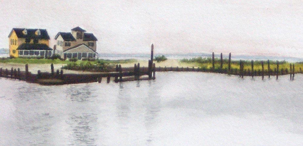
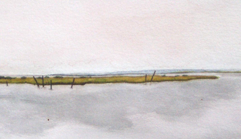
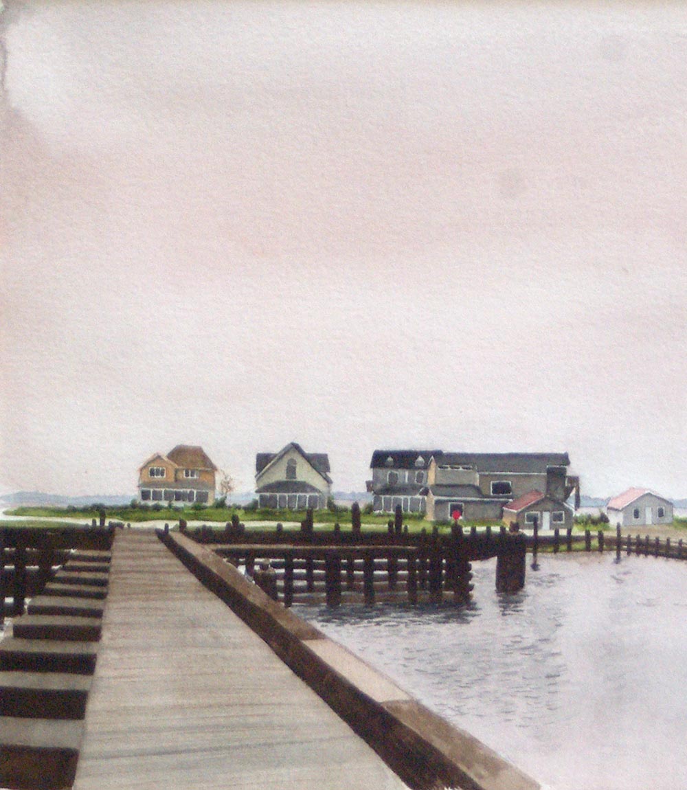
Detail of buildings
ABOUT THE ARTWORK
This original watercolor of beach houses on the Chesapeake Bay was painted from my own photos and memories. This is a view from Chincoteague Island across the Chesapeake Bay toward the mainland in Virginia. That stillness, that odd pink light of a sultry evening on the bay…the beach houses along the dock looked so puny and unprotected under that huge sky above and the water below that I took several photos in the days before panoramic images were available. Later, I brought them out and laid them side by side on my drafting table and sketched the scene onto a full sheet of watercolor paper, not knowing how much of the sky and water I’d use and leaving plenty of extra. I was just experimenting with watercolor techniques and materials and knew I wanted the clarity of the details on the beach houses to contrast with the big sky and water.
I first saw the ocean at the age of 30 when I visited Assateague Island, Virginia and felt as if I’d come home to an old friend; I also enjoyed meeting the wild ponies after having read all the books in the “Misty of Chincoteague” series and read about the island and wildlife refuge. I conspired how to make a living so I could stay there, but instead brought my photos back and have been painting from them ever since.
SHIPPING AND CHARGES
Shipping within the US is included in the cost of each print.
Prints up to 16″ x 20″ are shipped flat in a rigid envelope. Larger prints are shipped rolled in a mailing tube unless otherwise requested; flat shipping is an extra cost because it’s oversized.
Other items with the same art or design To find all items on this site with the same art or design, use the search box for the name of the artwork and you'll find all that's available.![]()
![]() Don’t miss any new items or opportunities!
Don’t miss any new items or opportunities!
“Follow” the Portraits of Animals blog with the link in the upper left. Sign up to receive posts in email, or in your favorite reader using the links in the right-hand column.
Sign up for e-newsletters
You can also sign up for my monthly e-newsletters to receive special discounts and find out where I’ll be with my artwork.
Click here for the Creative Cat Preview E-newsletter, for feline and animal-specific products and information.
Click here for the Art & Merchandise E-newsletter, for landscapes, nature, urban scenes and more.
For art, photos and writing as I develop it, visit my blogs.
See feline art and photos as they happen on The Creative Cat, along with feline news, health, welfare, rescue stories and more.
See daily photos as I post them on Today.
Read poetry, short stories, essays and more on Paths I Have Walked.
. . . . . . .
© 2016-2026 | www.PortraitsOfAnimals.net | Published by Bernadette E. Kazmarski
All images used on this site are copyrighted to Bernadette E. Kazmarski unless otherwise noted and may not be used without my written permission. Please ask if you are interested in using one in a print or internet publication. If you are interested in purchasing a print of this image or a product including this image, check to see if I have it available already. If you don’t find it there, visit “purchasing” for availability and terms.
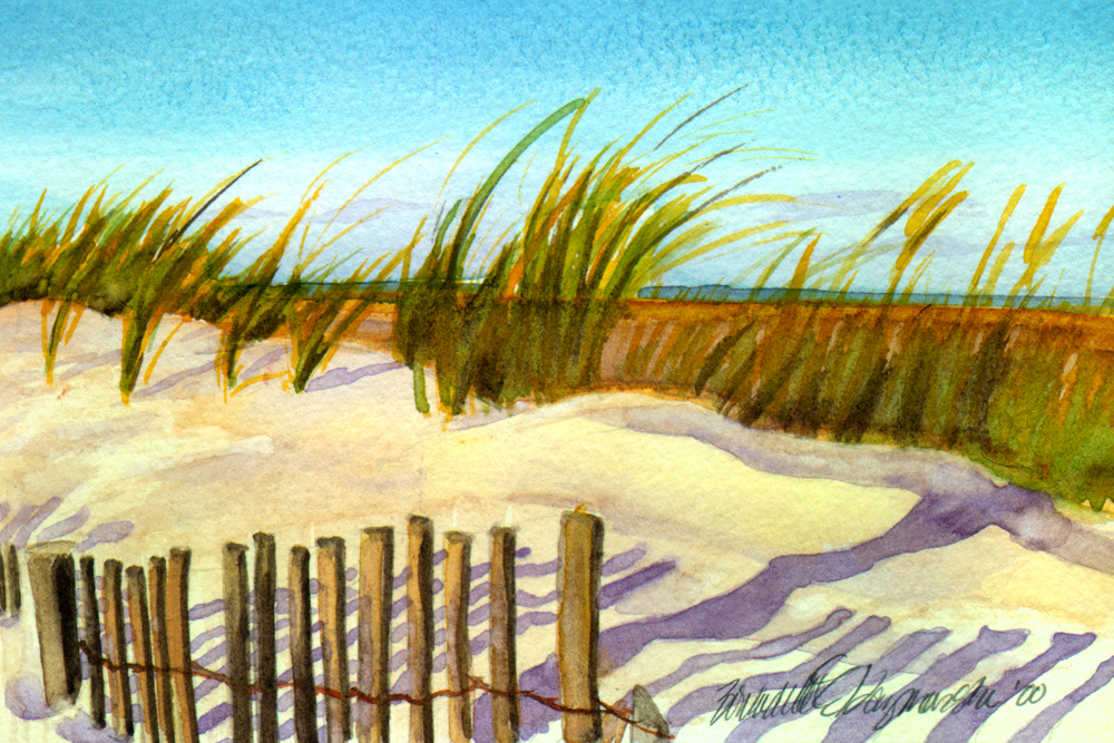
Evening Beach is a watercolor, 8 x 10, painted in 2000. I offer it in three sizes and styles of prints.
ABOUT THE ARTWORK
Evening Beach, watercolor, 8 x 10, 2000 © Bernadette E. Kazmarski
-
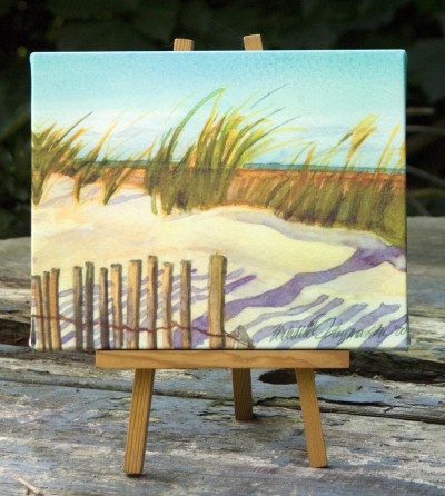
- Evening Beach canvas print.

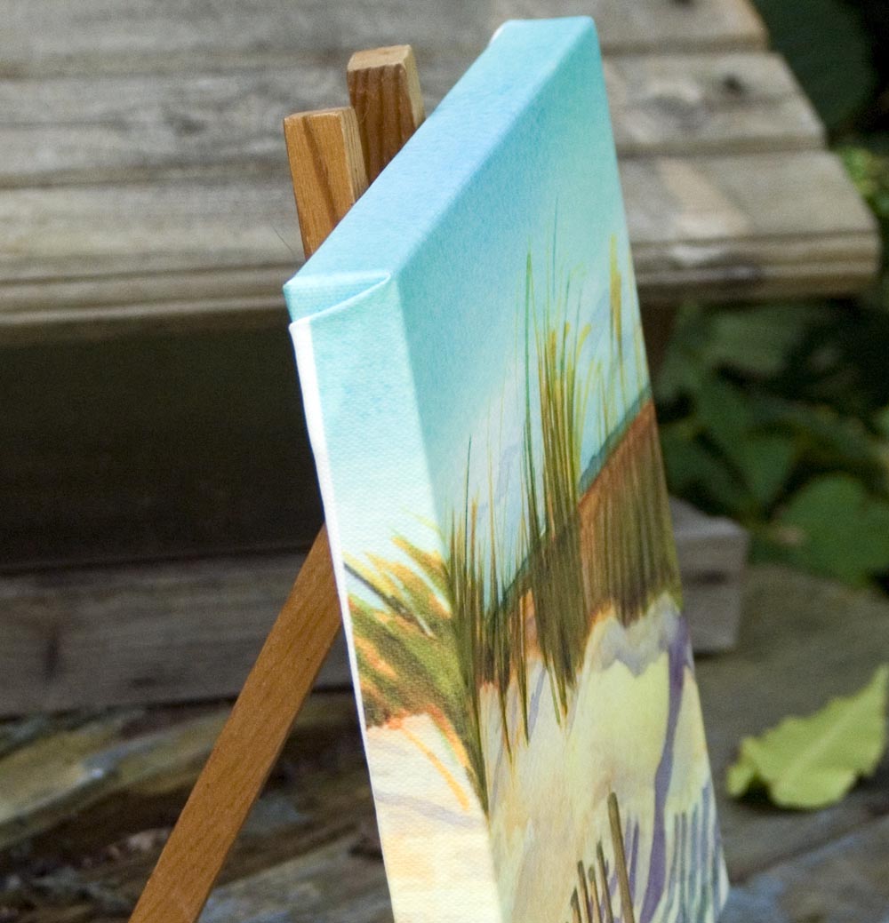
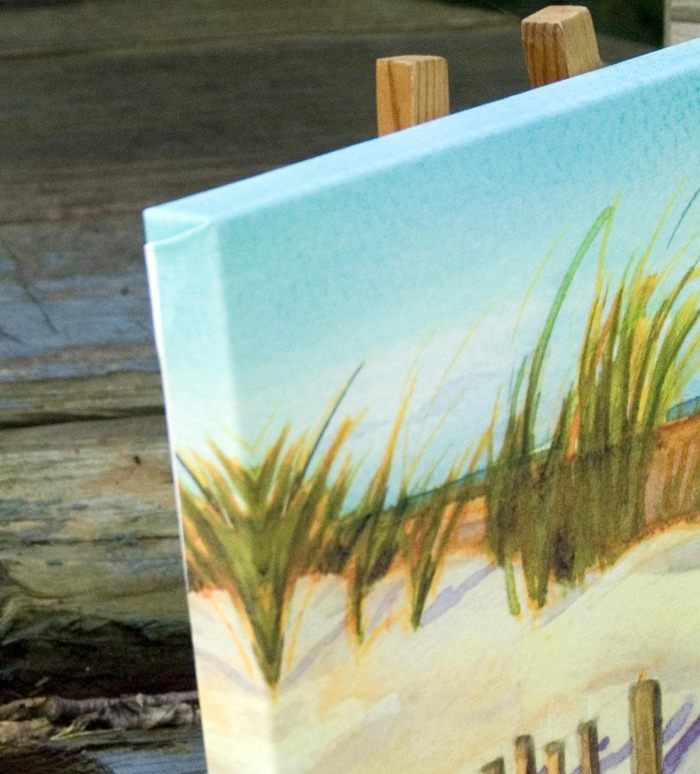
After the first time I visited the beach I discovered that sand was much like snow, my other favorite subject, in the tones and colors it held in all the different lights of day. I liked this quiet scene as the wind picked up at evening.
SHIPPING AND CHARGES
Shipping within the US is included in the cost of each print.
Prints up to 16″ x 20″ are shipped flat in a rigid envelope. Larger prints are shipped rolled in a mailing tube unless otherwise requested; flat shipping is an extra cost because it’s oversized.
Other items with the same art or design To find all items on this site with the same art or design, use the search box for the name of the artwork and you'll find all that's available.![]()
![]() Don’t miss any new items or opportunities!
Don’t miss any new items or opportunities!
“Follow” the Portraits of Animals blog with the link in the upper left. Sign up to receive posts in email, or in your favorite reader using the links in the right-hand column.
Sign up for e-newsletters
You can also sign up for my monthly e-newsletters to receive special discounts and find out where I’ll be with my artwork.
Click here for the Creative Cat Preview E-newsletter, for feline and animal-specific products and information.
Click here for the Art & Merchandise E-newsletter, for landscapes, nature, urban scenes and more.
For art, photos and writing as I develop it, visit my blogs.
See feline art and photos as they happen on The Creative Cat, along with feline news, health, welfare, rescue stories and more.
See daily photos as I post them on Today.
Read poetry, short stories, essays and more on Paths I Have Walked.
. . . . . . .
© 2016-2026 | www.PortraitsOfAnimals.net | Published by Bernadette E. Kazmarski
All images used on this site are copyrighted to Bernadette E. Kazmarski unless otherwise noted and may not be used without my written permission. Please ask if you are interested in using one in a print or internet publication. If you are interested in purchasing a print of this image or a product including this image, check to see if I have it available already. If you don’t find it there, visit “purchasing” for availability and terms.
This is a pastel painting, “Waiting for Mom”, pastel, 16″ x 23″, 1988 © Bernadette E. Kazmarski
About the painting, and Fawn
One night in early April, 1988, still with patches of snow on the frozen earth, a very small, very pregnant cat sang a little song to me out in the alley, politely but confidently asking if she could come into my home to give birth to her kittens. Of course, I said “yes”, and ten days later I witnessed the entrance to life of four independent and individualistic progeny. The last one born stayed with me after the others were adopted; the “runt of the litter”, the little cat with the big attitude, a torbie who loved only me, my Fawn.
This was my first full-color portrait of one of my cats, and she led the way to all the other commissioned portraits of animal companions I’ve done in the past 20 years.
This is Fawn’s story in Great Rescues Day Book.
Creating the portrait, this first one just for me
And so it was, though I had no idea at the time that I was launching a new career. And looking at this painting even today, I have no idea how I did it then. I didn’t have the skill, insight, ability to visualize or any of the ephemeral abilities I have now, but I managed to see the essential details and put them on paper.
But I didn’t set out to create a portrait—that was all in the future—and, for this last time, with the knowledge that I never needed to show it to anyone, ever, if I didn’t think it was acceptable.
I painted this in 1989, just about three years after I began seriously working my way through learning to draw simply by drawing all the time, after work at night and on the weekend—and of course, I was painting my cats. It is painted in pastel, but when I began I hadn’t even purchased real pastels yet, I was still working largely in colored chalk. I purchased an inexpensive student set of pastels and continued working with the new colors, then purchased individual pastels and pastel pencils, then just got a part time job at the art store because everything was so darned expensive and I was hooked.

I remember looking at the photo I’d taken the year before when Fawn was a kitten and thinking “that would make a nice painting”—so funny to think of now as I look at other photos every day and think the same thing, 23 years later, but then I’d hardly even have called myself a beginner. The nerve of me! Of course, I adored Fawn being excessively cute when she ran under the bed and peeked out, waiting for me to walk by so she could pop out and grab my ankle, and my inspiration was just as much to share her and her antics as it was to produce a good painting. Really, that hasn’t changed in all these years.
But I was also intrigued by the “white” dust ruffle, seeing for perhaps the first time all the colors that make up a true white object in a painting. I really, really wanted to paint this, fairly large, and in color. I wasn’t visualizing it as realistic as it is, more impressionistic was the style I had in mind. I can see the influence of Mimi Vang Olsen, and Lowell Herrero, two artists whose feline images were very popular then, appearing on many gift items I received, and I was influenced by the flattening of some angles and simplification of pattern.
At that time I found it difficult to loosen up my style. I had worked on my skills just in basic drawing to the point where I felt I had a good bit of control over what my hands were doing and the image I produced no longer looked stiff or forced, at least most of the time. But I loved the Impressionists, and I wanted to paint like that!

It wasn’t to be for this painting, and in many ways I’m glad. This painting took me months, in part because I was intent on matching the shade of yellow in the gingham bedspread and also quibbling with myself about all the details that weren’t “perfect”, such as the nicks and scratches on the bedpost, the wrinkle in the rug, and, of course, the wrinkles in the dust ruffle and bedspread. I was embarrassed at my housekeeping, but an artist friend of mine convinced me that those were the things that added interest and character to the painting. I learned so much more in the art of painting what I actually visualize rather than what I know, and adding what I feel.
After all the time spent on other details, Fawn the kitten was sketched in there in probably just a few hours! And while I do like the simplicity of her face I sometimes wish I had made Fawn’s eye as round as it actually is because it adds that essence of excitement to her look that truly makes it a cute kitten, and Fawn.
In the end, this was the painting I looked at and said to myself, “I think I can really do this,” and the painting others looked at and asked, “Can you paint my cat too?” The rest is all in my portfolio, and for this reason, Fawn’s portrait is the first portrait in my first Great Rescues Day Book, a tribute to the kitten who led me to that part of myself that could find the essence of my animal portrait subject and bring my portraits to life.

About Fawn
Fawn was a real live wire as a kitten—always swinging from something and talking about it—and was very attached to me; I had known her from her first moment of life and I was always honored at being the the only living being in the world Fawn liked.
And even though, years later, we’d moved and changed the bedspread and dust ruffle, at least once a day when I went upstairs Fawn still dove under the bed and peeked out, waiting for me to walk past so that she could leap out and grab my foot. Little did I know when I chose to paint this when Fawn was about one year old that this moment would be one I would seriously want to remember.

And especially so, when a mere ten years later I lost her to lymphoma, though through the pain of my grief she sent me a wonderful sign that she accepted what had happened; read The Balloon.
And Fawn has inspired other works, most notably “Fawnball” and the series of block prints entitled “Tabbies“.
I will always be thankful to Fawn for giving me this gift. She is one of the family of cats in the dedication to this calendar:
Thank you, Kublai, Sally, Stanley, Allegro, Moses and Fawn,
my first feline family, for patiently showing me the way;
only gone from this mortal life, you are immortal in everything I create.
Purchasing prints
This painting is included on one set of cards, “Feline Fine Art Cards”.
SHIPPING
Shipping within the US is included in all the prices listed. All shipping is via Priority Mail. Prints are shipped flat in a rigid envelope. Canvases are shipped in a box to fit with padding. Since this original is small it is also shipped in a box with extra padding.
GICLEE PRINTS
The giclees are printed on acid-free hot press art paper for a smooth matte finish using archival inks. Giclee is the highest quality print available because the technique uses a dozen or more ink ports to capture all the nuances of the original painting, including details of the texture, far more sensitive than any other printing medium. Sometimes my giclees look so much like my originals that even I have a difficult time telling them apart when they are in frames. The giclees have 2″ of white around the outside edges.
I don’t keep giclee prints in stock for most of my works. Usually I have giclees printed as they are ordered unless I have an exhibit where I’ll be selling a particular print so there is a wait of up to two weeks before receipt of your print to allow for time to print and ship.
DIGITAL PRINTS
Digital prints are made on acid-free matte-finish natural white 100# cover using archival digital inks. While digital prints are not the quality of a giclee in capturing every nuance and detail of color, texture and shading, I am still very pleased with the outcome and usually only I as the artist, could tell where detail and color were not as sharp as the original.
The 5″ x 7″ and 8″ x 10″ digital prints are centered on 8.5″ x 11″ digital cover while the 11″ x 14″ has 1″ around the edges because the digital paper is 12″ wide. All are countersigned by me.
CANVAS PRINTS
I usually have at least one of the smaller sizes of canvases on hand, but order larger ones as they are ordered here because customers often want a custom size. Smaller canvases are a 3/4″ in depth, Canvases 12 x 16 and larger are 1-1/2″ in depth. I set them up so the image runs from edge to edge, then the sides are black or white or sometimes I slip in a color that coordinates with the painting. This canvas is black on the sides.
MOUSEPADS
Mousepads are 8″ x 7″, always horizontal, 1/4″ black foam rubber with the image printed on a flexible fabric on top.

The original of Birches 2: Radiance was ink and watercolor, 22″ x 23″, on 300 lb. smooth watercolor paper.
[ss_product id=’48a867dc-80bc-11e6-af4c-002590787d08′ ]Landscape, “Birches 2: Radiance”[/ss_product]
ABOUT THE ARTWORK
-

- Birches 2: Radiance, watercolor, 22 x 23, 1998 © Bernadette E. Kazmarski
-

- Birches 2, detail.
-
- Birches 2, detail.
-
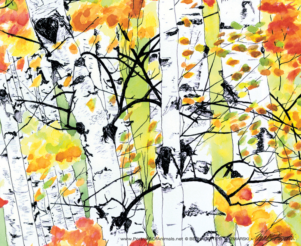
- Birches 2, detail.
-
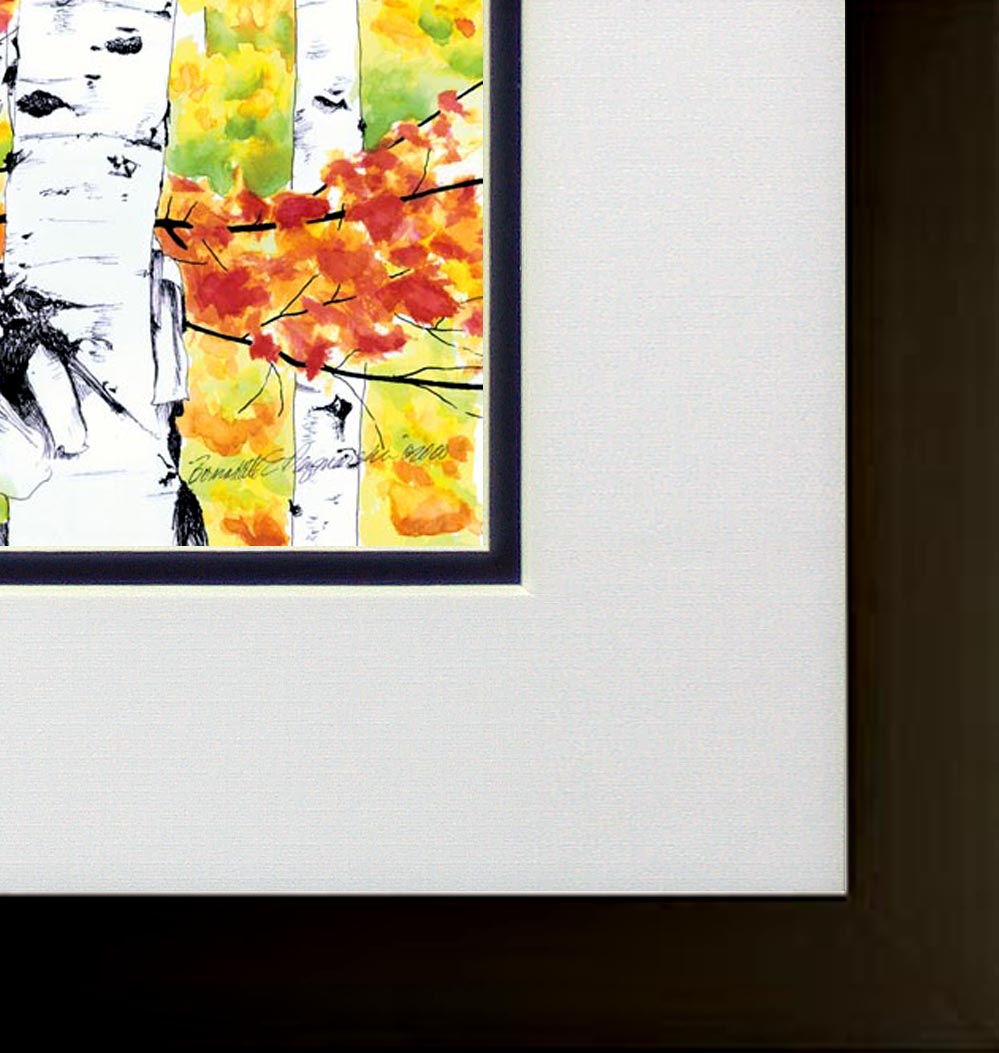
- Birches 1, framed.
-
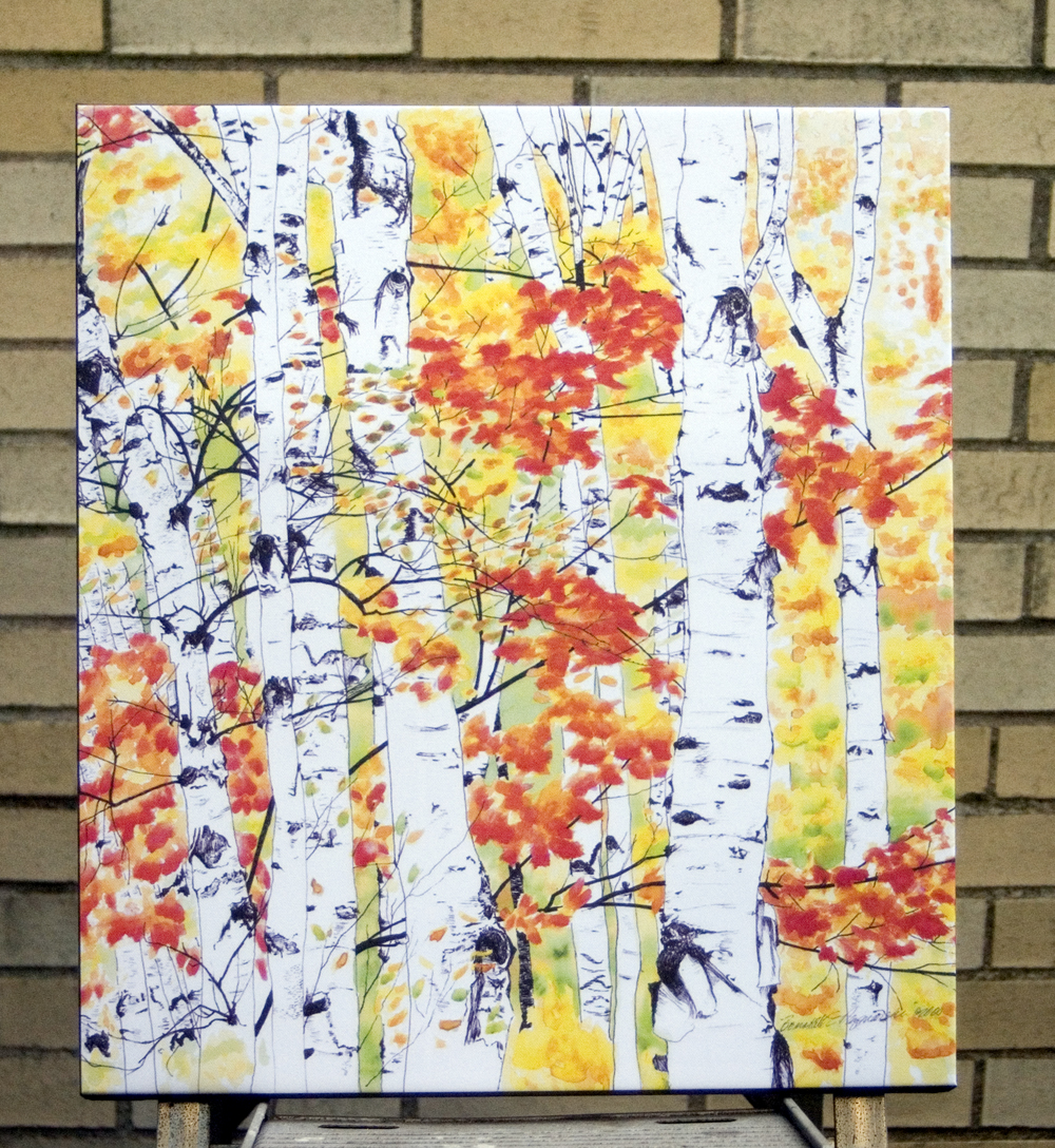
- 16 x 20 canvas
-
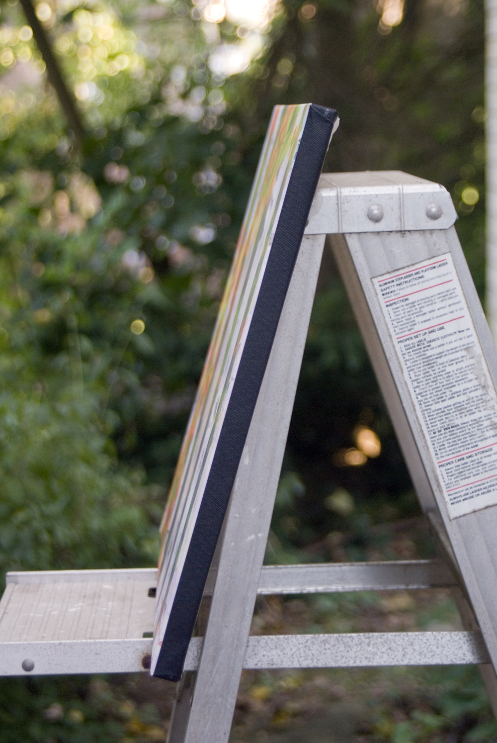
- Side view of canvas.
We have lovely birch groves here in Western Pennsylvania, and this image was reminiscent of one I had encountered while walking through the woods somewhere near me. Not just the white bark, but the contrast with the thin dark twigs and ripples in the bark, is eye-catching, and that autumn display of yellow leaves is nearly blinding. Add a few other leaves to the mix and it becomes a classic autumn scene.
This painting is a real favorite in any color or size; I think viewers react to the details and the colors as I did when I saw the scene and visualized the painting.
The original is quite large, 22″ x 23″, and drawn in a very fine line black ink. I used a technical pen to draw all the details of the birch trees, taking nearly three weeks just to draw the trees. Even though I’d been visualizing it with the color added for the leaves, after all that work I was hesitant to start painting into the drawing for fear I’d mess it up and ruin all that work. But I got over that and began painting in the leaves in all shades of yellow, orange and red.
See also Birches 1: Autumn Showers.
Birches 1, Autumn Showers, oil pastel, 24.5 x 18, 1998 © Bernadette E. Kazmarski
SHIPPING AND CHARGES
Shipping within the US is included in the cost of each print.
Prints up to 16″ x 20″ are shipped flat in a rigid envelope. Larger prints are shipped rolled in a mailing tube unless otherwise requested; flat shipping is an extra cost because it’s oversized.
GICLEE PRINTS
The giclees are printed on acid-free hot press art paper for a smooth matte finish using archival inks. Giclee is the highest quality print available because the technique uses a dozen or more ink ports to capture all the nuances of the original painting, including details of the texture, far more sensitive than any other printing medium. Sometimes my giclees look so much like my originals that even I have a difficult time telling them apart when they are in frames.
I don’t keep giclee prints in stock for most of my works. Usually I have giclees printed as they are ordered unless I have an exhibit where I’ll be selling a particular print so there is a wait of up to two weeks before receipt of your print to allow for time to print and ship.
DIGITAL PRINTS
Digital prints are made on acid-free matte-finish natural white 100# cover using archival digital inks. While digital prints are not the quality of a giclee in capturing every nuance and detail of color, texture and shading, I am still very pleased with the outcome and usually only I as the artist, could tell where detail and color were not as sharp as the original. Digital prints are only available up to 11″ x 17″ and some of the prints are cropped to fit standard mat and frame sizes.
Digital prints have at least 1/2″ around the edges depending on the size of the print. All are countersigned by me.
CANVAS PRINTS
Because the standard size canvas prints are not proportional to the original painting, canvas prints of this painting will have a portion cropped off.
I usually have at least one of the smaller sizes of canvases on hand, but order larger ones as they are ordered because I have limited storage space. Smaller canvases are a 3/4″ in depth, Canvases 12 x 16 and larger are 1-1/2″ in depth. I set them up so the image runs from edge to edge, then the sides are black or white or sometimes I slip in a color that coordinates with the painting. This canvas is black around the sides.
FRAMED PRINTS
I do all my own framing and can custom frame a print for you. Please ask.


Serenity, pastel, 5 x 20, 1998 © Bernadette E. Kazmarski
This is a signed digital print of an original painting, “Serenity”, pastel, that’s 5 x 20, just a long which I painted to fit a frame I recycled.
-
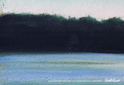
- Left

-
- Center
-

- Right
ABOUT THE ARTWORK
This sailboat drifted lazily for hours on the calm waters of Lake Arthur in Western Pennsylvania. As the August afternoon tended toward evening, the sky began to grow pink and the shadows darkened and lengthened, and the serene moment seemed to last for hours.
Painted en plein air as I sat on one of the beaches at the north end of the lake, watching this sailboat was one of my favorite afternoons; this painting always takes me back to that day.
Because of the odd size of this painting, the only reasonable reproduction is a giclee or a digital print, but I also offer custom framing.
Framed print
I use a white mat with a plain square 1″ pine frame in the sample above. Other mat and frame choices may cost more.
SHIPPING AND CHARGES
Shipping within the US is included in the cost of each print.
Prints up to 16″ x 20″ are shipped flat in a rigid envelope. Larger prints are shipped rolled in a mailing tube unless otherwise requested; flat shipping is an extra cost because it’s oversized.
These cards are 4-1/4″ x 5-1/2″ with matching envelopes, blank inside. Cards are printed in soy-based ink on 25% cotton fiber stock with a 35% recycled content. In addition, the paper was manufactured in the USA using windpower using no bleach from trees in a managed woodlot. Can’t get much cleaner than that.
They are available in sets of 9 as described below. Sets of individual images or different combinations are available on request.
- Cards are also available individually for custom quantities or sets.
- Cards are blank inside but can be customized with your message for an extra charge.
- “Feline Pencil Sketches” cards do not assort with any other cards .
- Price includes shipping via First Class or Priority Mail.

-
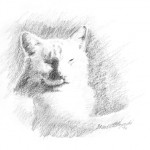
- Don’t Wake Me Up
-
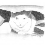
- In the Bag
-
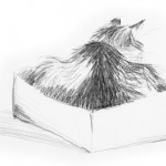
- In the Box
-
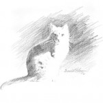
- Moses in the Sun
-
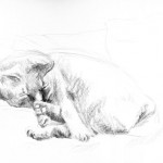
- Pawse
-
- Note card: Ready for Play
-
- “Stripes”, pencil, 8″ x 5″, 2002 © B.E. Kazmarski
-
- Sleeping Beauty.
-
- Conversation with a Daisy
ABOUT THE CARDS, THE CATS AND THE ARTWORK
My ever-inspiring family of felines causes me to carry both my camera and a sketch pad around the house. Quick, simple pencil sketches catch them hanging around the house and are my favorite warm-up to creating larger pieces of artwork. While I could live three lifetimes and never be finished with the images I can create from my group, friends also give me photos that are too good to pass up. Pencil can be challenging to reproduce, and I’m happy to introduce a new series in addition to my pen and ink and my full-color fine art notecards series.

“In the Garden” cards features eight of my favorite paintings of gardens and still lifes, many of them scenes from my own yard and home. Cards have no message on the front and are blank inside but can be customized inside with your message. They are 5″ x 7″ , printed on 12 or 14 pt. card stock and include a matching envelope.
[ss_product id=’3bd73552-e589-11e5-a44b-0cc47a075d76′ ]In the Garden, Columbines[/ss_product]
- Cards are blank inside but can be customized with your message for an extra charge.
- In the Garden cards assort with all other 5″ x 7″ greeting cards (except custom printed cards) for a quantity discount.
- Price includes shipping via Priority Mail.
ABOUT THE ARTWORK
Columbines
Another piece borne of January inspiration in my seed and flower catalogs, this little bunch of columbines was so joyful that it stayed with me. One of my favorite flowers, it is also a favorite of my mother, and I gave this painting to her as a birthday present one year. She has since passed away and I’ve sold her home, and kept the artwork I’d done. I sold the original to a good friend to give to her mother but this image will always remind me of her.
You’ll also find many of these images in my “Fine Art and Portraiture” galleries if you’d like a print. Often customers purchase a greeting card just to frame as well.

“In the Garden” cards features eight of my favorite paintings of gardens and still lifes, many of them scenes from my own yard and home. Cards have no message on the front and are blank inside but can be customized inside with your message. They are 5″ x 7″ , printed on 12 or 14 pt. card stock and include a matching envelope.
[ss_product id=’1e5ecc24-e589-11e5-a150-0cc47a075d76′ ]In the Garden, Garden Gate[/ss_product]
- Cards are blank inside but can be customized with your message for an extra charge.
- In the Garden cards assort with all other 5″ x 7″ greeting cards (except custom printed cards) for a quantity discount.
- Price includes shipping via Priority Mail.
ABOUT THE ARTWORK
The Garden Gate
If I can’t have it in my yard, at least I can paint it. The arbor sporting ivy, the old azalea crowning the entrance and the gate, mysteriously left ajar and leading to a stone path to another part of the garden. This was inspired by seed catalogs, magazines and photos of others’ gardens.
You’ll also find many of these images in my “Fine Art and Portraiture” galleries if you’d like a print. Often customers purchase a greeting card just to frame as well.

“In the Garden” cards features eight of my favorite paintings of gardens and still lifes, many of them scenes from my own yard and home. Cards have no message on the front and are blank inside but can be customized inside with your message. They are 5″ x 7″ , printed on 12 or 14 pt. card stock and include a matching envelope.
[ss_product id=’93cdbf9c-e589-11e5-95f7-0cc47a075d76′ ]In the Garden, Red Climbers[/ss_product]
- Cards are blank inside but can be customized with your message for an extra charge.
- In the Garden cards assort with all other 5″ x 7″ greeting cards (except custom printed cards) for a quantity discount.
- Price includes shipping via Priority Mail.
ABOUT THE ARTWORK
Red Climbers
This photo reminded me of my mother’s climbing red roses which grew up a trellis on the side of the house. These roses have always fascinated me because they just keep going—up the fence, over the fence, down the other side. As a watercolor it was pure pleasure, with enough color, light and shadow and shape for it to be interesting.
You’ll also find many of these images in my “Fine Art and Portraiture” galleries if you’d like a print. Often customers purchase a greeting card just to frame as well.

“In the Garden” cards features eight of my favorite paintings of gardens and still lifes, many of them scenes from my own yard and home. Cards have no message on the front and are blank inside but can be customized inside with your message. They are 5″ x 7″ , printed on 12 or 14 pt. card stock and include a matching envelope.
[ss_product id=’af61b38a-e589-11e5-83b1-0cc47a075d76′ ]In the Garden, Tea for Tulips[/ss_product]
- Cards are blank inside but can be customized with your message for an extra charge.
- In the Garden cards assort with all other 5″ x 7″ greeting cards (except custom printed cards) for a quantity discount.
- Price includes shipping via Priority Mail.
ABOUT THE ARTWORK
Tea for Tulips
I knew I’d love to paint the tulips, but I really needed to learn to paint the rust on the teapot. I intentionally kept the background vague and loose in shades of green and neutral tones to complement the brilliant reds, oranges and yellows and extreme detail in each of the tulips. The frothy white curtain, minimally worked, rests atop the flowers as if a spring breeze from the open window has whipped it up and gracefully placed it there.
You’ll also find many of these images in my “Fine Art and Portraiture” galleries if you’d like a print. Often customers purchase a greeting card just to frame as well.

This is a pastel painting, “A Warm Bath”, pastel, 12″ x 10″, 1997 © Bernadette E. Kazmarski.
About the painting
I chose this pose because you could still see Sally’s face, though she was looking down, and there is something I love about a cat’s face at that angle, the soft forehead, the nose, the whiskers sprouting here and there.
This painting sold in the days before I took adequate photos, and though I’ve been working on getting an image of the original I just have to live with this for now, so I don’t have any closeups. Still, this is the painting where I remember the feeling of “fingerpainting” for the first time, applying layers and colors of pastel, them mixing them with my fingertips and knuckles, the sides of my hands, both hands, a different color in each area. It was because I looked at the fur on Sally’s head in the reference photo and imagined digging my fingers into it to scratch the top of her head, which she loved, and I did my best to make the top of her head make me, and you, want to do that, even to feel it. The bright pink of her ear, the cool and warm highlights in her fur, it was all I could do to focus on one area to work it out completely.
Then there were the long angled shadows from the metal muntins in the windows, on the wall and book case and on Sally, the white-painted stucco wall, and the dappled side yard outside the window. I’m still very pleased with this painting, and even if I painted it today I may do some things differently, but I don’t think I could improve on this.
About Sally
The little deaf cat who began her life with me as a distant and defensive, emotionally neglected one-year-old grew into one of my greatest friends through our fourteen years together. A “pet quality” Angora kitten, she’d been adopted for her looks, the perennial kitten face, silky white fur, petite size. Not all white cats are deaf, but most Turkish Angora cats turn out to be, and the person who “bred” her didn’t warn the adopting party. The person who adopted her truly loved her, but between her high activity level and eventual deafness, and his schedule of being out most of every day, she became a little wild child, unaccustomed to being handled in any way. I heard later that Angora kitties are known for being physically combative and don’t necessarily like to be touched, but when I adopted Sally I thought it was just her youth and kittenhood that had influenced her personality.
This was very early in my rescue career; I had two cats, believe it or not, my first cat, gray and white Bootsie, and my first cat adopted as an adult, solid black Kublai. Sally was cat number three.
Read more about my beautiful whipped cream kitty in “My First “Less Adoptable” Kitty”.
Purchasing prints
This painting is included on one set of cards, “My Cat in the Sun”.
SHIPPING
Shipping within the US is included in all the prices listed. All shipping is via Priority Mail. Prints are shipped flat in a rigid envelope. Canvases are shipped in a box to fit with padding. Since this original is small it is also shipped in a box with extra padding.
GICLEE PRINTS
The giclees are printed on acid-free hot press art paper for a smooth matte finish using archival inks. Giclee is the highest quality print available because the technique uses a dozen or more ink ports to capture all the nuances of the original painting, including details of the texture, far more sensitive than any other printing medium. Sometimes my giclees look so much like my originals that even I have a difficult time telling them apart when they are in frames. The giclees have 2″ of white around the outside edges.
I don’t keep giclee prints in stock for most of my works. Usually I have giclees printed as they are ordered unless I have an exhibit where I’ll be selling a particular print so there is a wait of up to two weeks before receipt of your print to allow for time to print and ship.
DIGITAL PRINTS
Digital prints are made on acid-free matte-finish natural white 100# cover using archival digital inks. While digital prints are not the quality of a giclee in capturing every nuance and detail of color, texture and shading, I am still very pleased with the outcome and usually only I as the artist, could tell where detail and color were not as sharp as the original.
The 5″ x 7″ and 8″ x 10″ digital prints are centered on 8.5″ x 11″ digital cover while the 11″ x 14″ has 1″ around the edges because the digital paper is 12″ wide. All are countersigned by me.
CANVAS PRINTS
I usually have at least one of the smaller sizes of canvases on hand, but order larger ones as they are ordered here because customers often want a custom size. Smaller canvases are a 3/4″ in depth, Canvases 12 x 16 and larger are 1-1/2″ in depth. I set them up so the image runs from edge to edge, then the sides are black or white or sometimes I slip in a color that coordinates with the painting. This canvas is black on the sides.
MOUSEPADS
Mousepads are 8″ x 7″, always horizontal, 1/4″ black foam rubber with the image printed on a flexible fabric on top.
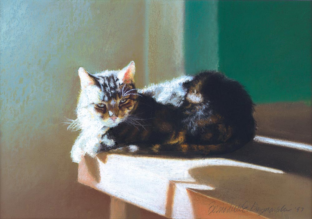
This is a pastel painting, “After Dinner Nap”, pastel on Hahnemuhle sanded watercolor paper, 1997 © Bernadette E. Kazmarski
About the painting, and Stanley
“The face that launched a thousand portraits,” my Stanley, the feline mascot of my business, appearing on my business card and brochure cover. As I set up the pages for this site I sat back and thought about possibly using another piece of artwork as my signature for the site.
I decided that my whole relationship with Stanley and this painting is too significant a part of my career to change it.
This portrait changed my world, as an artist and in my career. The day I finished this portrait in 1997, I knew I had reached a higher level of skill as an artist and a deeper level of visualization combined with that skill that goes way beyond reproducing what I see, very far into what I feel. Stanley was a difficult soul having been abused before he was dumped outdoors, but his real personality was sweet, fun, silly and relaxed, and for all his issues I loved him completely. In this scene, the after dinner nap he enjoyed just about every day, I found that part of him, and that part of me, and got it onto the paper. It’s been magic since then, not just with my portraits and other animal artwork, but with all my artwork. I may have arrived at that point as an artist eventually, but it was my deep feeling for Stanley that delivered me to the door, which I had only to open.
Many cats have inspired me since this portrait in 1997, which is why feline art is featured here. Painting my cats, in turn, led to painting the landscape around me, the local areas which I’ve loved since I was a small child, and still lifes and then painting wildlife.
Stanley was with me for 21 years, and considering that he was an adult when he arrived on my porch of his own accord, that meant he was nearing the quarter-century mark when he died in 2007, inspiring until the end as I was photographing and sketching him until his final month. Please read more stories about Stanley, and see other art and photos featuring him on The Creative Cat where I’ve been writing about my cats for years.
Purchasing prints
This painting is included on one set of cards, “My Cat in the Sun”.
SHIPPING
Shipping within the US is included in all the prices listed. All shipping is via Priority Mail. Prints are shipped flat in a rigid envelope. Canvases are shipped in a box to fit with padding. Since this original is small it is also shipped in a box with extra padding.
GICLEE PRINTS
The giclees are printed on acid-free hot press art paper for a smooth matte finish using archival inks. Giclee is the highest quality print available because the technique uses a dozen or more ink ports to capture all the nuances of the original painting, including details of the texture, far more sensitive than any other printing medium. Sometimes my giclees look so much like my originals that even I have a difficult time telling them apart when they are in frames. The giclees have 2″ of white around the outside edges.
I don’t keep giclee prints in stock for most of my works. Usually I have giclees printed as they are ordered unless I have an exhibit where I’ll be selling a particular print so there is a wait of up to two weeks before receipt of your print to allow for time to print and ship.
DIGITAL PRINTS
Digital prints are made on acid-free matte-finish natural white 100# cover using archival digital inks. While digital prints are not the quality of a giclee in capturing every nuance and detail of color, texture and shading, I am still very pleased with the outcome and usually only I as the artist, could tell where detail and color were not as sharp as the original.
The 5″ x 7″ and 8″ x 10″ digital prints are centered on 8.5″ x 11″ digital cover while the 11″ x 14″ has 1″ around the edges because the digital paper is 12″ wide. All are countersigned by me.
CANVAS PRINTS
I usually have at least one of the smaller sizes of canvases on hand, but order larger ones as they are ordered here because customers often want a custom size. Smaller canvases are a 3/4″ in depth, Canvases 12 x 16 and larger are 1-1/2″ in depth. I set them up so the image runs from edge to edge, then the sides are black or white or sometimes I slip in a color that coordinates with the painting. This canvas is black on the sides.
MOUSEPADS
Mousepads are 8″ x 7″, always horizontal, 1/4″ black foam rubber with the image printed on a flexible fabric on top.
Some of these images date back to the very beginnings of my belief in myself as an artist, some are fine, some are not good representations, some I still have. All are dear to me.
-
- Green Apples, oil pastel, 12 x 12, 1998 © Bernadette E. Kazmarski
-

- Home


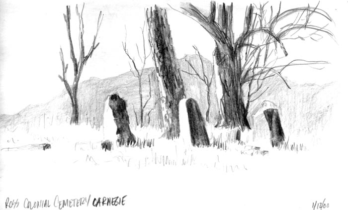

-

- Birches 1, Autumn Showers, oil pastel, 24.5 x 18, 1998 © Bernadette E. Kazmarski
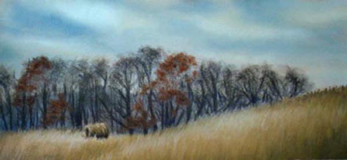
-
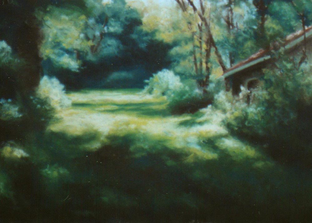
- Exhibits
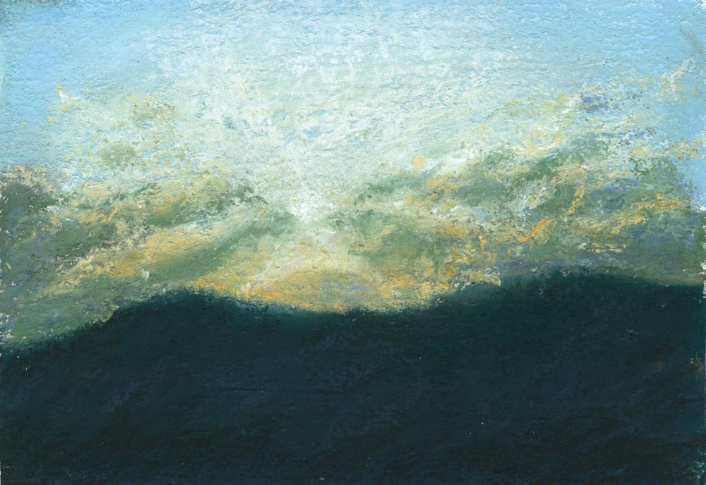
-
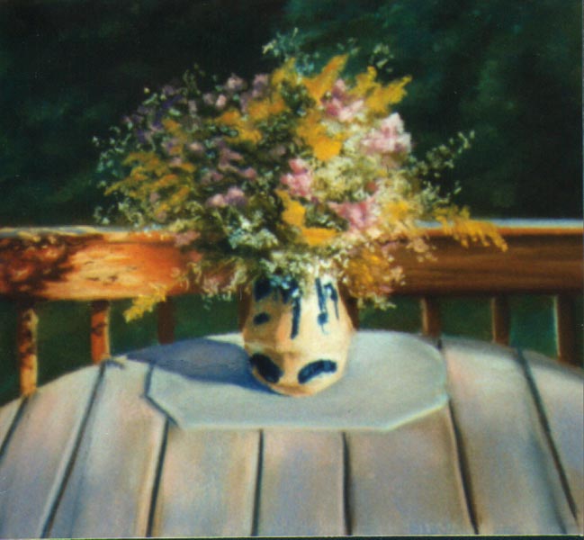
- Autumn Wildflower Harvest, 10″ x 12″, pastel, 1996 © Bernadette E. Kazmarski

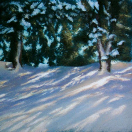
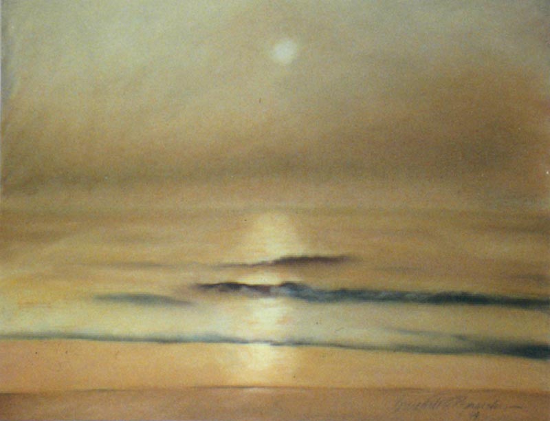
-
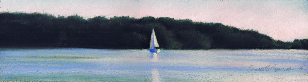
- Serenity, pastel, 5 x 20, 1998 © Bernadette E. Kazmarski

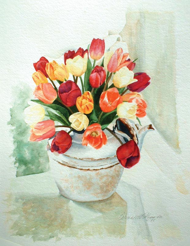


-
- Dawn, pastel, 5 x 8, 2000 © Bernadette E. Kazmarski

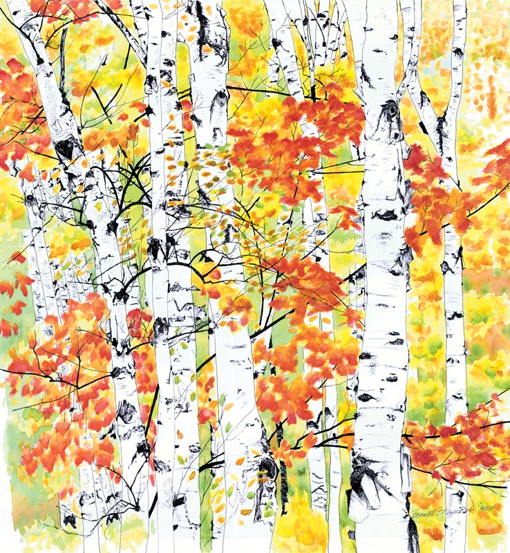


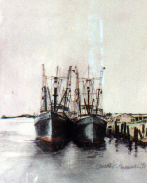
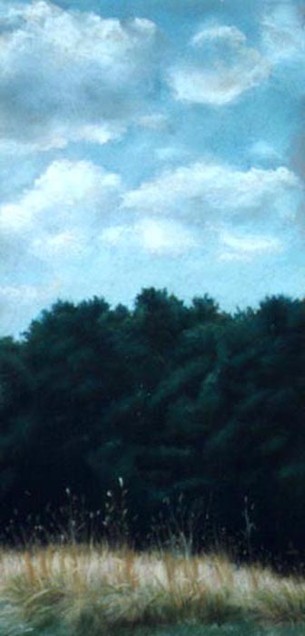


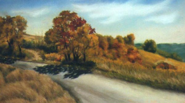
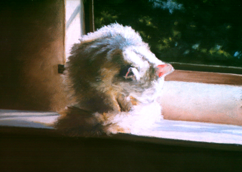
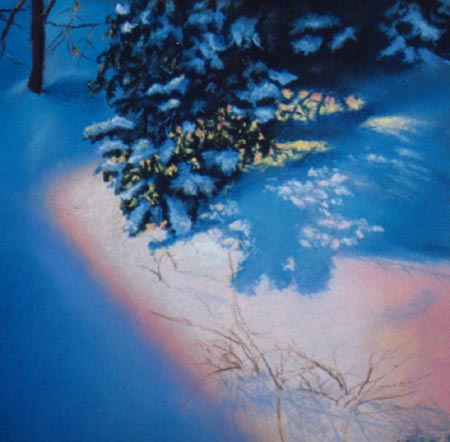
-

- Interior With Cat, watercolor, 8 x 12 © Bernadette E. Kazmarski

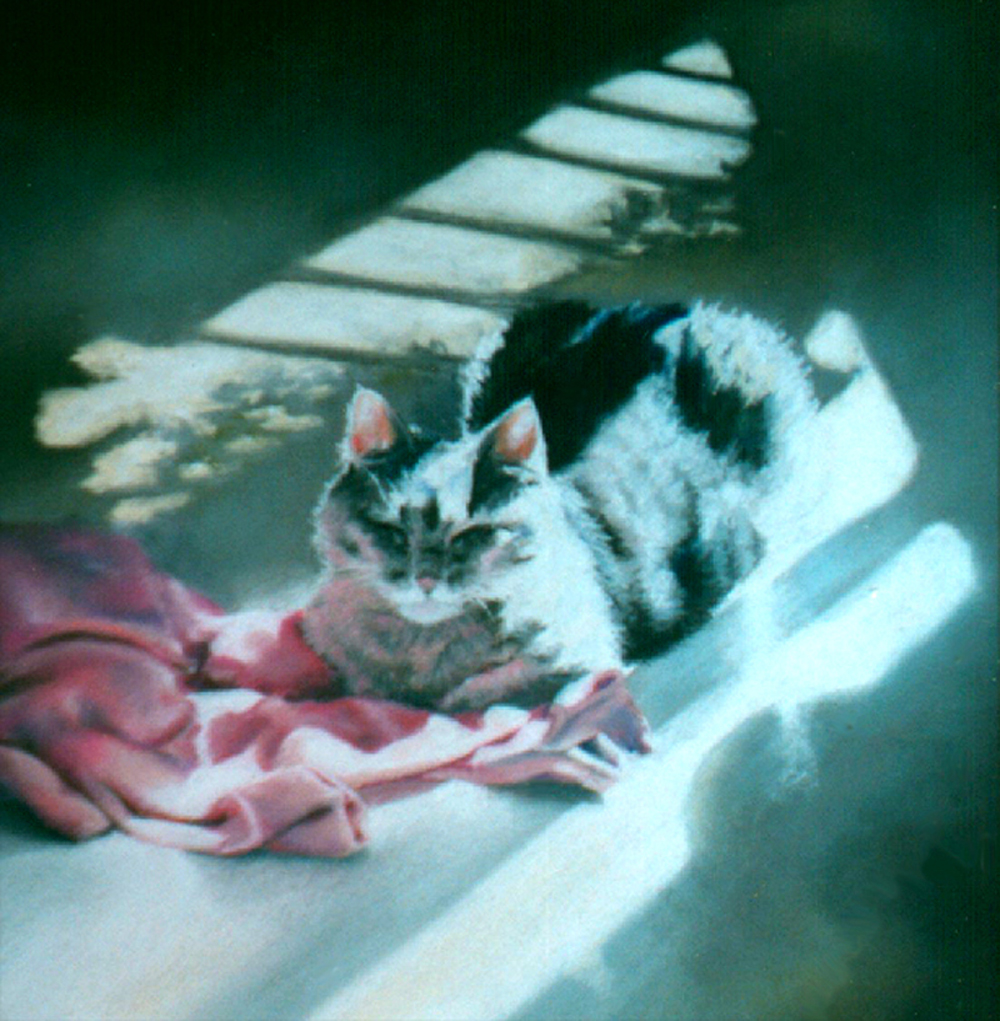
I am adding my exhibit pages as time permits. Visit “Exhibits” for a list of all of my solo exhibits to date.
Other items with the same art or design
To find all items on this site with the same art or design, use the search box for the name of the artwork and you'll find all that's available.
![]()
![]() Don’t miss any new items or opportunities!
Don’t miss any new items or opportunities!
“Follow” the Portraits of Animals blog with the link in the upper left. Sign up to receive posts in email, or in your favorite reader using the links in the right-hand column.
Sign up for e-newsletters
You can also sign up for my monthly e-newsletters to receive special discounts and find out where I’ll be with my artwork.
Click here for the Creative Cat Preview E-newsletter, for feline and animal-specific products and information.
Click here for the Art & Merchandise E-newsletter, for landscapes, nature, urban scenes and more.
For art, photos and writing as I develop it, visit my blogs.
See feline art and photos as they happen on The Creative Cat, along with feline news, health, welfare, rescue stories and more.
See daily photos as I post them on Today.
Read poetry, short stories, essays and more on Paths I Have Walked.
. . . . . . .
© 2016-2026 | www.PortraitsOfAnimals.net | Published by Bernadette E. Kazmarski
All images used on this site are copyrighted to Bernadette E. Kazmarski unless otherwise noted and may not be used without my written permission. Please ask if you are interested in using one in a print or internet publication. If you are interested in purchasing a print of this image or a product including this image, check to see if I have it available already. If you don’t find it there, visit “purchasing” for availability and terms.